INTERACTIVE DESIGN Exercises1
GCD 60904 / INTERACTIVE DESIGN
Exercises1
Bachelor of Design (Honours) in Creative Media
LIU CHENG RUI (0370930)
Lecture notes
Week2
In the first week of class, Mr. Rahman first gave us a brief personal introduction, and then explained the arrangement and tasks of this semester's courses to us. Then Mr. Rahman began to tell us about website design and asked us to design the website as a group.
Exercises
Week2 EX Web Analysis
1.
I chose WLKR76 from the Site of the Day Awards.
This is a website about shoes sales. When I enter the website, the first thing I see is the eye-catching product pictures, and I can quickly understand the product styles they sell. This shows that this website can push product information to users in the first time and effectively.

Eye-catching product images
With the slide of the mouse, more information about the product is displayed in the form of pictures and videos, which brings me a different browsing experience, because whether it is color or typesetting, it is complementary to the layout of the entire website, the color is relatively elegant, and will not stimulate the eye too much: the typesetting looks less crowded under the premise of ensuring the introduction of product information. What I appreciate more is the introduction of the product. If you want to see the specific information of which parts of the product, you can rely on the navigation guidance of the website, which is more convenient and fast, and you can also clearly understand the product information you want to obtain.
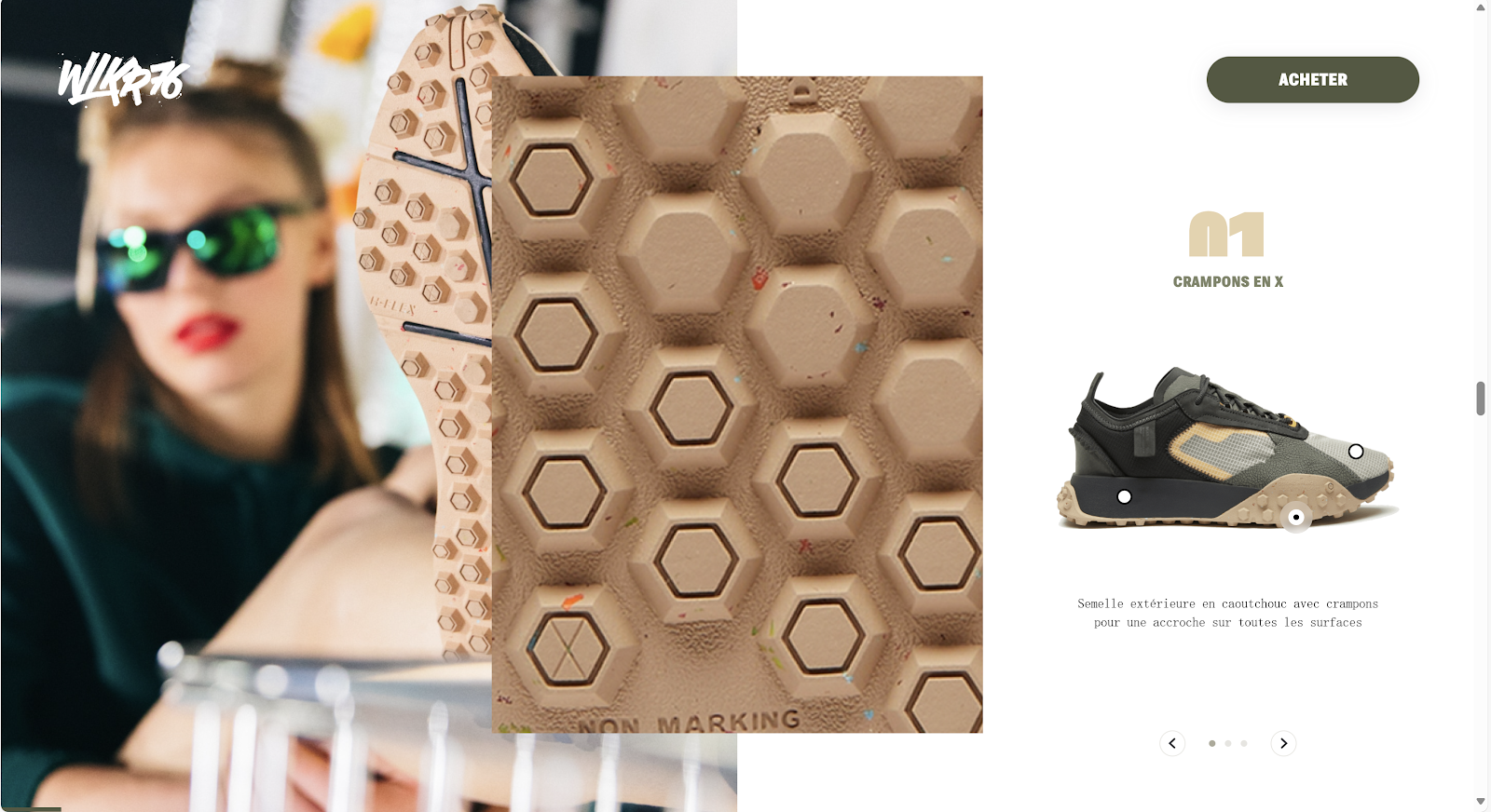
Clear understanding of all parts of the product
If you still have a skeptical attitude that words alone can't explain anything, the product display of the model at the bottom of the website can fully understand the overall shape of the product and help product selection.

Model's product presentation
Overall, I think the site gave me an extraordinary experience, both in terms of navigation system and aesthetics, and it ran smoothly while ensuring that many aspects of the product were introduced.
2.
My second choice is Virtual Farm CleverFarm from the Site of the Day Awards, which is a similar virtual farm site that I am also very interested in.
When the mouse clicks on the site, the first page appears like a game load, which can't help but impress me. This loading method is not the same as the traditional white screen loading, and I think it will keep the user from getting bored while waiting, but will be attracted by the interesting loading.

Loading interface
When I successfully entered the website interface, a whole 3D virtual farm appeared, I was very surprised, and then I tried to find a navigation system to learn the next step, and this is also I think the most interesting part, because if you want to learn how the farm is produced, you only need to click on the corresponding scenery. For example, if I want to know about the arable land on the farm, I can click on the harvester directly. In this way, the farm information can be more intuitive to the user.

Get information about harvesters
If you think that such a 3D farm will run smoothly, then you are very wrong, it runs just like an ordinary website, without any delays, and the camera switch is extremely smooth.
In general. The site has a clear advantage in the clarity and accuracy of the information delivered to the user, because it has a real 3D scene that simulates farm production. The navigation system is also cleverly designed so that users can find the information they want at first glance. Finally, the site works with any browser, so you don't have to worry about that.
Feedback
Week2
In the second week of the course, I have a preliminary understanding and understanding of this course, it seems to focus more on practice and user feedback, and I also have some expectations for the next content.


Comments
Post a Comment