Typography Task 2
TYPOGRAPHY | TASK 2: TEXT FORMATTING & EXPRESSION
|| 27/05/24 – 10/06/24 (Week 6 – Week 8)
|| LIU CHENG RUI (0370930)
|| Typography
|| Task 2: Typographic Exploration & Communication (Text
Formatting and Expression).
This task requires the combination of skills learned in Exercise 1 & 2. Also, the final outcome is expected to be suitable, impactful, memorable and engaging.
3. Process Work
LECTURE 4 - TEXT (PART 2)
Ways to indicate paragraph include (but not limited to): pilcrow (¶), paragraph space, indent and extended paragraphs.

Ways to emphasize text for different contrast within a text column:
Example to highlight text.
Example to highlight text.
Example to highlight text. --- Reduce/increase size to match x-height.
Example to highlight text. --- Use black, cyan, magenta for best contrast &
legibility on a black BG.
Example to highlight text. --- Box aligns left margin (visuals) vs Maintain
left reading axis (readability).
"Example to highlight text." --- Create clear indent vs Breaking the left reading
axis.
• Example to highlight text. --- Extending to maintain strong reading axis vs
Indenting.
Other tips:
- Avoid serious gaffes: widows & orphans. ¶Solution for widows: Rebreak (Shift + Enter) your line endings throughout your paragraph, so that the last line is not noticeably short. ¶Solution for orphans: Resize length of column.
- Text hierarchy: A, B, C heads.
- Ensure visual cohesion of aligned numbers/ capital acronyms in text: (1) Reduce their size by 0.5 pt. (2) Use lowercase numerals/capitals.
- Cross aligning headlines & captions with text type - reinforces architectural sense of the page (the structure), while articulating the complimentary vertical rhythms.

Figure 1.2 Examples of different
treatment for headings & subheadings, Week 5
(1/5/2023).
 Figure 1.3 Cross alignment between
headlines & captions with text type, Week 5
(1/5/2023).
Figure 1.3 Cross alignment between
headlines & captions with text type, Week 5
(1/5/2023).
Other notes:
- Leading vs Line Space: Leading is named as leading in typography because historically typefaces are composed using lead square matrices with each line separated by a leading.
- Prime vs Quotation marks
- Widows vs Orphans
.png) Figure 1.4 Leading vs line space , Week 5 (1/5/2023).
Figure 1.4 Leading vs line space , Week 5 (1/5/2023).

 Figure 1.5 & 1.6 Leading in different thickness & leadings spaed between
the lead typefaces, Week 5 (1/5/2023). Source: CreativePro Network & Scrap Girls.
Figure 1.5 & 1.6 Leading in different thickness & leadings spaed between
the lead typefaces, Week 5 (1/5/2023). Source: CreativePro Network & Scrap Girls.
.png)
Figure 1.7 Prime (above two; ' means inches, '' means feet) vs Quotation
marks (bottom two), Week 5 (1/5/2023).
.png) Figure 1.8 Widow vs Orphans, Week 5 (1/5/2023).
Figure 1.8 Widow vs Orphans, Week 5 (1/5/2023).
LECTURE 5 - UNDERSTANDING
Observe & compare:
- Stroke weights
- Arc of brackets connecting the serif to the stem
- Symmetrical/-
- How the stems finish
- How the bowls meet the stems
- Maintaining of the x-height
- Counterforms//counters (the space)
- Median line. The line above the baseline. Curved strokes must exceed median line and baseline to look optically same size.
Some tips on creating typefaces:
- Don't overload your typeface with a lot of characteristics. As this leads to a very decorative but also very sophisticated letterform. Simplify your characteristics within the strokes of your letters and it needs to be replicable in all the other letter forms (consistency).
- Examine counters.
- Include design principles into your typography: Contrast.
.png) Figure 1.9 White spaces are forms,
black spaces are counters, Week 5 (1/5/2023).
Figure 1.9 White spaces are forms,
black spaces are counters, Week 5 (1/5/2023).
Importance of understanding forms and counters:
- How well you handle counters when you set type determines how well words hang together (aka how easily we can read the words).
- Examining them in close detail provides a good feel for how the balance between them is achieved and a palpable sense of letterform's unique characteristics.
- Gives a glimpse into the process of letter-making.
.png) Figure 1.10 Examine forms and
counters in close detail, Week 5 (1/5/2023).
Figure 1.10 Examine forms and
counters in close detail, Week 5 (1/5/2023).
.png) Figure 1.11 Variations of contrast,
the most potent dynamic, Week 5 (1/5/2023).
Figure 1.11 Variations of contrast,
the most potent dynamic, Week 5 (1/5/2023).
LECTURE 6 - PRINT & SCREEN
 Figure 1.12 Example of typography
on screen with some comments on it, Week 5
(1/5/2023).
Figure 1.12 Example of typography
on screen with some comments on it, Week 5
(1/5/2023).
Good common typeface for print: Caslon, Garamond, Baskerville (characteristics of elegant, intellectual & highly readable when set a small font size. Versatile, easy-to-digest).
Things to consider for screen:
- Typeface: taller x-height (or reduced ascenders & descenders), wider letterforms, more open counters, heavier thin strokes and serifs, reduced stoke contrast, modified curves and angles for some designs. ***Nowadays due to advancement of screen quality (resolutions), problems used to be there are no longer there. Example: Verdana, Georgia. ¶Typefaces intended for smaller sizes are more open spacing (to improve character recognition and overall readability in screen).
- Font size: 16 px (20-24 pt) text on a screen ≈ 12 pt text printed in a book/magazine. This is accounting for reading distance. If we read books pretty close: few inches away, then 10 pt; If read at arm length, 12 pt.
- Use system fonts for screen/web safe fonts: Open Sans, Lato, Arial, Helvetica, Times New Roman, Times, Courier New, Courier, Verdana, Georgia, Palatino, Garamond.
- Pixel differential between devices. 100 pixels on laptop vs 100 pixels on a big 60'' HDTV will have different quality.
.png) Figure 1.13 Pixel differential between devices, Week 5
(1/5/2023).
Figure 1.13 Pixel differential between devices, Week 5
(1/5/2023).
Static typography. Having minimal characteristics in expressing words. Bold & italics only offers a fraction of the expressive potential of dynamic properties. The level of impression and impact they leave on the audience is closely knitted to their emotional connection with the viewers. Although static, there is a possibility to include dynamics!
.png)
Figure 1.14 Static vs Motion in static
typography, Week 5 (1/5/2023).
Motion typography can "dramatize" type to become "fluid" or" kinetic". Often overlaid onto music videos and advertisements, in motion following the soundtrack rhythm. It can help to establish the tone of associated content or express a set of brand values. In title sequences, typography must prepare the audience for the film by evoking a certain mood.
Video 1.1 Example of motion typography
--- Se7en, Week 5 (1/5/2023). Source: MrAndycrappers78.
"A great designer knows how to work with text not just as
content, he treats text as a user interface."
- Oliver
Reichenstein
2. INSTRUCTIONS
Task 2: Typographic Exploration & Communication
(Text Formatting & Expression) (20%)
Typographically compose and express the given content. No
color and images are allowed, but some very minor graphical
elements: line, shade, etc. might be allowed.
Explore several options in expression and layout (sketches). Execute a good layout, with an expressive and appropriate headline in line with the spirit/message of the text.
- 2-page editorial spread (200mm x 200mm per page)
- With baseline grid (JPG & PDF)
- Without grid (JPG & PDF)
Marking Criteria:
- Explorations. The typographic expression has been explored in great variety and creatively.
- Communication. The expression conceptually and typographically communicates the meaning being conveyed.
- Format. The textual information is extremely well formatted (font size, line-length, leading, alignment, cross alignment, reading rhythm, information hierarchy, widows and orphans).
- Layout & Composition. Suitable, impactful, memorable and engaging.
- To demonstrate the use of Grids, layouts and page flow.
- To apply the necessary skills and sensibilities for effective typographic communication and achieve good reading rhythm with memorability.
Timeframe:
- Week 8 – Week 9 (Deadline on Week 10)
3. PROCESS WORK
1.Sketeches
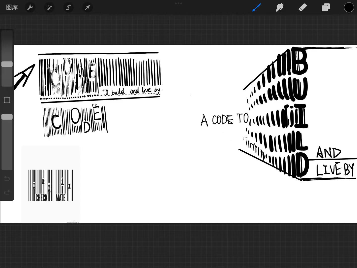


Finally, the teacher chose these sketches and allowed me to digitize them


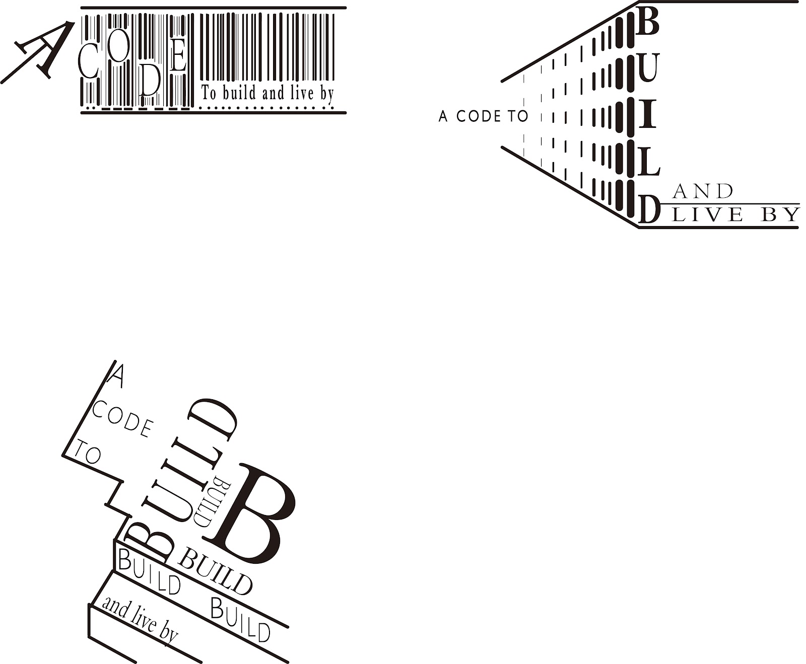


The teacher pointed out some inadequacies and areas for improvement in my digitization last week.


4. FEEDBACK
week6
This week, under the guidance of the teacher, I started to learn a new section. By absorbing the experience and reflection of the previous section, I have a certain ability to deal with this week's homework. For example, when using AI to design questions, I can use many tools more easily, and the corresponding homework is not so difficult.
week7
This week, the teacher pointed out some shortcomings and improvements in my digitization last week in class, such as how to make the digital design more concise and clear. At the same time, I also learned some new tools, such as 3d and perspective grid, and I also applied them in my revision homework.
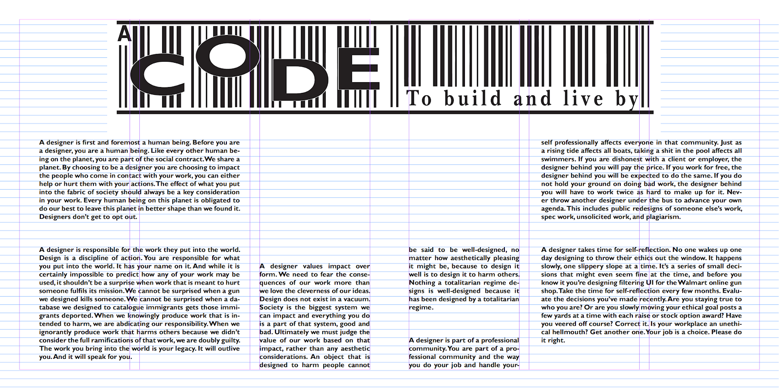
week8
This week, I made new modifications to the last typesetting assignment and adjusted the final typesetting task according to the relevant requirements of the teacher. I found that although there were not so many mistakes compared with the last part of the assignment, there were still some small problems.
5. REFLECTION
Experience
After the study of this part of the course, I have been exposed to more knowledge about typography, and I am also more comfortable with the application of software.
Observations
I have observed that in order for your layout to look comfortable, you first need to make sure that each part is unified, for example, apply the appropriate font to your title and text, and make them look like they are not divided, but more like a whole. Secondly, the integration of graphic elements and text elements needs to consider a number of factors to ensure that they will not appear ugly because the text is too large or the graphics are too small.
Findings
I found that the digitization of typesetting requires more knowledge to perfect, and I also noticed that many seemingly subtle differences, such as fonts or word spacing, will be greatly different in the process of digitization, so I think I should have a more subtle understanding of typesetting to reduce the occurrence of small mistakes.
6. FURTHER READING
Further Reading


Comments
Post a Comment