TYPOGRAPHY | TASK 3: TYPE DESIGN & COMMUNICATION
TYPOGRAPHY | TASK 3: TYPE DESIGN & COMMUNICATION
|| 10/06/24 – 22/07/24 (Week 8 – Week 13)
|| Liu Cheng Rui, 0370930
|| Typography
|| Task 3: Type Design &
Communication.
3. Process work
Week9
In this lesson, Teacher Max shows us how to use three kinds of pens to draw our font design. It also tells us that we can use Procreat to complete the sketch on the tablet and perform font analysis.
Week10
In this tutorial, Mr. Max takes us through deconstructing the m of the Bembo font and lets us try another one after class, then shows us how to digitize our sketches more easily in Ai. And answered my questions about the letter O.
Week11
In this week's class, Mr. Max taught us to use a new software called "Fontlab7". I learned how to set preferences and import font designs from Ai. There were a few minor issues, such as problems with upper and lower case letters and punctuation, but they all worked out in the end
Week12
In this lesson, we were asked to make kerning adjustments to the fonts we designed using Fontlab7, and I learned how to make them readable and aesthetically pleasing. I also made some changes to my fonts to make them look more harmonious.
Task 3: Type Design & Communication (30%)
The end goal is to design a few western alphabets of your own design: e s c t i l o h g d n ! # , . To begin, study and analyze (deconstruct) anatomical parts of two existing font designs that adheres to the direction that you would like to head in. Then do rough sketches to explore the options and begin digitalization upon approval. Software: Adobe Illustrator (AI) then FontLab7 demo.
Finally, use the fonts to create a poster with a few rules:
- Letters that you use in your font should be a sentence of about 6 words (if include words like I, am); or a sentence of about 4 words (if your words are long).
- Cannot change the size of the sentence.
- Can play with alignment and composition.
- PDF (One portrait layout in A4 size)
- To write credits (eg. Kezia Serif by Vinod J. Nair, 2021.), use Univers (Regular) 12 pt, leading can be 2.5, 3 or larger for A4 paper.
Marking Criteria:
- Evidence of in-depth research and visual analysis is visible.
- Multiple ideas have been explored with great care and deliberation.
- The design process showcases knowledge of typographic convention, methodology and production.
- The designs are extremely well crafted, consistent and technically sound.
- To develop student’s ability to construct a readable and legible font.
- To develop student’s ability to design a font with consistent characteristics premised on research and analysis.
Timeframe:
- Week 8 – Week 13 (Deadline on Week 13)
3.1 Research
To begin, we are tasked to study and analyze anatomical parts of one (1) existing font designs from the 10 fonts given and one (1) other font from fonts.google.com, font.share.com, etc., by deconstruction or dissection. The purpose of deconstruction is to give us a general idea/principle of how other create their font.
I also observed how details of different letters differ from one and another
3.2 Exploration
The first time for font design, I chose to outline my sketch
on paper first, during which I drew on some works of the
website sent by the teacher, and completed the first version
of the sketch。

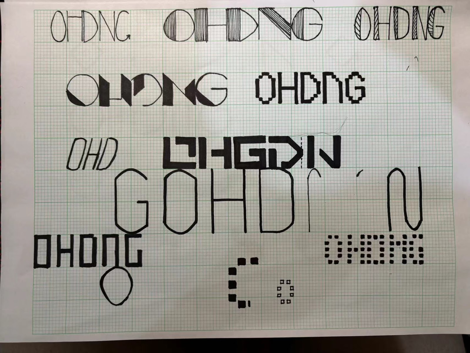
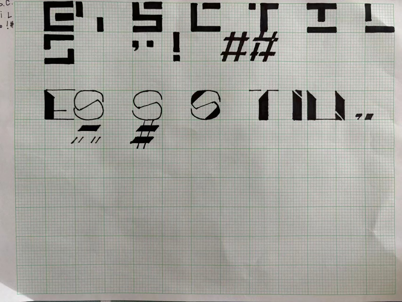
This sketch has some problems, for example, the stem of the
character # is different from other characters, so it needs to
be adjusted.
 Finally, the teacher chose two fonts and asked me to design the
remaining letters for comparison.
Finally, the teacher chose two fonts and asked me to design the
remaining letters for comparison.
Final sketch

 Uppercase version
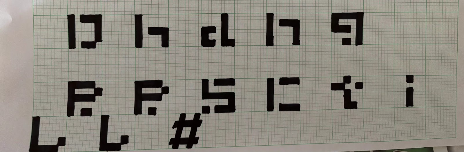 Lowercase version
3.2 Exploration
The first time for font design, I chose to outline my sketch on paper first, during which I drew on some works of the website sent by the teacher, and completed the first version of the sketch。
Final sketch
3.3 Digital Exploration
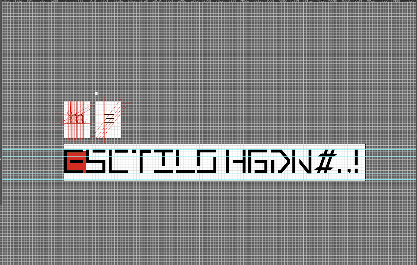 I try to use grid tools on AI software to assist me in
digitizing
I try to use grid tools on AI software to assist me in
digitizing
 The first attempt at digitization


week9
General feedback:
This week, we will study a new section again, that is, "Type Design & Communication". In the class, the teacher first told us the relevant knowledge and personally demonstrated the design of several letters. After class, I chose to borrow excellent works from the teacher's website first, and then try them myself. I found that the knowledge of font design has increased on the basis of the original module knowledge, and more points need to be paid attention to.
week10
General feedback:
In the tenth week of the course, the teacher first showed us the homework requirements for this week, and gave corresponding demonstrations, such as the demonstration of the letter M, and also told us about the auxiliary line and the position of letter upper and lower case in the digitization of letters. Taking the letters T Y D as an example, I understand that even the case of simple letters has certain typographical requirements.
week11
General feedback:
This week, Mr. max taught us to use a brand new software "FONTLAB", where we can change the digital fonts into our own fonts. When I handed my homework to Mr. max last week, he thought that my fonts still had some small problems in terms of spacing, and the design of # could be changed into the same form as other fonts. Finally, I successfully completed the import of fonts.
week12
General feedback:
This week, Mr. MAX reviewed my font design on fontlab, during which I think Mr. MAX asked about punctuation being the same size as font, which I needed to set in the preferences. After solving the problem, Mr. MAX suggested that I put my comma above baseline because it looked more harmonious with the other fonts.
As the task came to an end, I looked at the fonts I had designed and felt more satisfied and harvested.
5. REFLECTION
5.1 Experience
Through the learning of this stage of the task, I have mastered more knowledge about typography, among which the most beneficial thing is the subtle differences in fonts that Mr. MAX told me. Because I have many problems in this aspect, I try to understand this knowledge, and find that if you want your typography to be more beautiful, you must pay attention to these small differences.
5.2 Observations
In this stage of learning, we have used the software Fontlab for many times, which can help us make our fonts truly typed. In the process of using Fontlab, I have problems in font spacing, capitalization and punctuation size, etc. After communicating with Mr. MAX, I gradually adapt to and use this software.
In general, what this software brings me is more harvest and the application of some font knowledge I have learned. At the same time, I found that with the help of this software, I gradually took the initiative to use these fonts.
5.3 Findings
This task applies a lot of previous typography knowledge, which can be regarded as a fusion. I like this task, because I not only learn knowledge, but more importantly, I can have my own font, although the process is not smooth, and even a lot of trouble, but I enjoy the satisfaction of the moment when my font is completed.
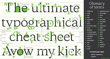
6. FURTHER READING


Comments
Post a Comment