Digital Photography and Imaging
(GCD 61204)
PROJECT 1 (20%)
PROJECT 1A:
Physical Collage (5%)
Digital Collage (5%)
PROJECT 1B:
Hearst Mansion (5%)
Recoloring Black & White (5%)
NAME: LIU CHENG RUI
I.D: 0370930
COURSE: DIGITAL PHOTOGRAPHY & IMAGING
GROUP: 1
EMAIL: 0370930@sd.taylors.edu.my
E-PORTFOLIO: (chengrui05.blogspot.com)
____________________________________________________________________________
Timeframe |
|
| Week 01 – Week 5 |
Deadline |
|
| Week 5 |
Description |
|
| Collage Design. 2 exercises related to Collage Design, one physical and one digital. The aim is to develop a theme/idea with layers of images with design principles.
|
Requirements |
|
| Weekly submissions. You are required to capture screenshots and compile it in E-PORTFOLIO blog. This should be modelled after a Photoshop/Illustrator tutorial (examples to be provided).
|
Submission | 1 |
| Digital submission through Google Classroom |
|
|
|
|
|
|
|
|
Learning Goals | 1 |
| Generate and communicate design concepts and solutions through manual and digital skills effectively and skilfully. (LO1) |
| 2 |
| Use creative thinking skills and methodologies to explore, generate and test a wide range of conceptual ideas. (LO2) |
| 3 |
| Use information and communication technology to source navigate, select, retrieve and manage information. (LO3) |
|
|
|
|
|
|
|
|
Assessment Criteria |
| Marking Criteria & % Distribution |
|
| Exercises | 20 % | MLO 2.1 | MLO 5.1 | MLO 6.1 | MLO 7.1 |
|
|
|
|
|
|
|
|
|
| Collage Exercise 1 | 10 | ✓ |
|
|
|
|
|
Digital Imaging Exercise 1
Digital Imaging Exercise 2
| 5
5 | ✓
✓ |
|
|
|
|
|
|
|
|
|
|
|
|
| Project 1 |
| 20% - Individual |
Lectures :
Week 1 (23/APR/2024)
After a brief introduction to the course, we experienced Photoshop for the first time and logged into our account Adobe Illustrator. Learn how to create your own blogger and join a right class group.
Week2(02/MAY/2024)
1. Basic composition introduction.
Focus - A key element of any good composition is a strong focal point.
SCALE & HIERARCHY-Scale is often used to help communication hierarchies attract certain elements by attracting attention.
Balance Elements - A good trick to master asymmetry Balance is to treat each element as having a "weight" on it.
WHITE SPACE- Help your design breathe.
2. Rules of Third.
Fig 1.0 Rules of Third
2. Rule number three.
Figure 1.0 Third rule
The rule of thirds is the process of dividing an image into two thirds, using two horizontal and two vertical lines. This hypothetical grid produces nine parts with four intersections.
3. Golden Ratio.
Figure 1.1 Golden Ratio
Through harmony and appreciation of beauty and proportion. When applied to design, the golden ratio provides a sense of artistry.
This is the decisive dimension of layout. You can set your size to 1:1.618 to apply the golden ratio
Fig 1.1 Golden Ratio
4. Composition framing & croppingIntroduction to Photoshop 2
Week 3 ( 07/MAY/2024)
1.Lasso Tool
The Lasso Tool allow you to draw and pinpoint specific areas of a document.
Fig 1.2 Lasso Tool
There are three different tool options: Lasso, polygonal lasso, and magnetic lasso.
After that, we learned how to use the lasso tool in the video.
2.Pen Tool
Fig 1.3 Pen Tool
There are four ways to use the pen tool: straight path, U-shaped curve, simple S-curve, and complex S-curve.
Fig 1.4Variation of Pen Tool
Next, we watched three videos to learn how to use the Pen tool. The next one uses the pen tool to compare the lasso tool to analyze the commonalities between the two. Although commonly used for selection, the pen tool was not created as a "selection tool."
3.Magic wand tool
The Pen tool is also used to introduce the wand tool, which can be clicked and automatically select the object area.
4.Layering
Layers are different images stacked on top of each other. You can use each layer to make adjustments without affecting the other layer.
The advantage of using layers is that you can save Photoshop files including all layers. This means that you can use layers for non-destructive editing.
Your adjustments in Photoshop will never destroy the original content image.
Week 4 ( 14/MAY/2024)
·Adjustment layers
Fig.1.5 Adjustment layers
Adjustment Layers in Photoshop are a super useful, non-destructive set of image editing tools that add color and make tone adjustments to an image without permanently changing its pixels.
You can edit and discard the adjustment or restore the original adjustment image at any time.
Fig.1.6 Basic understanding of Adjustment Layer
1. BRIGHTNESS / CONTRASTFig.1.7 Brightness/Contrast
The brightness slider is used to adjust the image and the contrast slider is used to adjust the shadow image.
2. LEVEL
Fig.1.8 Level
Shades, midtones, and highlights in an image are modified by adjusting the color levels.
3. CURVES
Fig.1.9 Curves
Curves allow you to work across the entire tonal range of the image for better results.
4. EXPOSURE
Fig.1.10 Exposure
Exposure consists of three parts - exposure (highlight only), offset (midtone), and Gamma (deep tone only).
Selective colour
Selectively modify the amount of primary colors without modifying other primary colors.
·Filters
Editing photos with filters is Adobe's graphics editor.
Curve's layer mask
Use CTRL+I to fill in black.
Then use the brush tool to erase the highlights.
Note: Match lighting. Adjust layers and filters
· Match lighting
Take the curve adjustment layer and bring it from the center up.
Click Select - Topics
Press Ctrl+Backspace
Press CTRL+I (Note: you can also click Image - Adjust - Invert)
You can find it in the toolbar at the bottom of the layers interface.
(Note: You can add adjustment masks on a single layer by cropping)
Note: Photoshop Pen Tool
Using the Pen Tool, select a path in the upper toolbar.
When you have finished selecting with the pen tool, right-click - Select.
Click "Select" (in the toolbar above) - Optimize Edge.
Smooth -20, contrast -30
Use the [] key to increase or decrease the brush size.
Brush back details and other stuff.
PROJECT 1
PART 1A: Physical Collage (5 marks)
Refer to this video tutorial:
https://youtu.be/2KqXGMf0HNk
INSTRUCTION:
Step 1: Cut out design elements
Explore and search for any interesting graphics from old magazines or any printed materials.
Cut the shapes of pictures that you are choosing.
Repeat the steps to collect your cut out design elements.
Step 2: Pre-compositing
1. Find an interesting background canvas
2. Start compositing the cut out design elements
3. Play around with the composition and layer arrangement.
Step 3: Final composition
1. Once you’re satisfied with your pre-compositing, start glueing the cut out based on the layer by layer arrangements.
2. Document your work in progress on each step and upload it to your E-Portfolio blogs for the weekly contents update.
3. Take photo of your collage and insert on the submission section below:
Practical
Exercise 1
Design #1:

Pinterest |
Description: This picture brings me a spirit of hard work and study, and the colors are bold and contrasting
This picture contains three colors, black, white and red. The red color is mainly distributed in the top of the picture and has a prominent appearance, which emphasizes the visual center to a large extent and makes it easy for people to understand the content described in the picture. The weightlifter in the center of the upper red area symbolizes the human brain's hard thinking about chess, while the other red color is on the black chess in the lower left corner. Use a strong color contrast to highlight the difficulty of the battle between man and chess. |
Design #2:
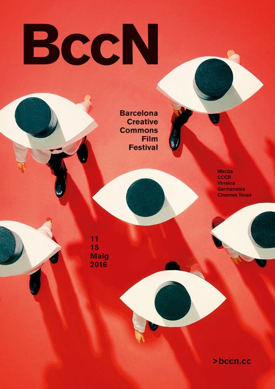
Pinterest |
Description:This picture repeats the same figure to highlight the central idea, and I guess it may be intended to express the meaning of gaze, which has a deep meaning
My first impression from this picture is that many eyes are watching me, but it is actually lots of people wearing hat. This picture gives me the feeling that people who seem to have nothing to do with each other are observing in other ways, mainly using three colors of red and black, with strong and sharp contrast. The large area of red in the background makes people shudder, plus it resembles multiple eye patterns, which makes me have to think deeply about the internal meaning |
Design #3:

Pinterest |
Description: This drawing uses deconstruction techniques to divide the subject matter and form an object similar to a hollow box, and the visual center uses strong black and white contrast. It gives people a sense of a step-by-step search for a secret, but each search leads to the same answer. The main object adopts three-dimensional design, but there are two-dimensional circles distributed around it, and the contrast between the shapes makes the whole picture look not stiff. |
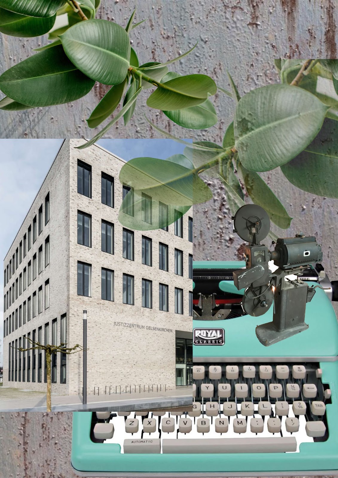
Exercise 2(WEEK 2:PRACTICAL COLLAGE ELEMENTS)
1. PRE-COMPOSITION #1
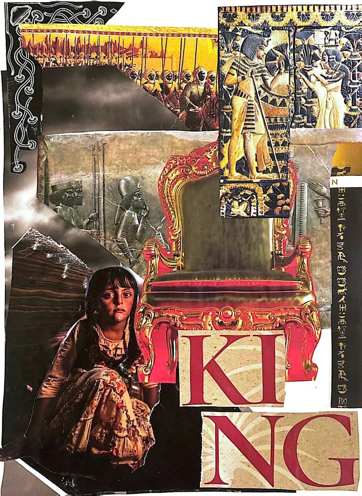
The contrast between the apparent prosperity of the crown and the hardship of the people at the bottom
2. PRE-COMPOSITION #2
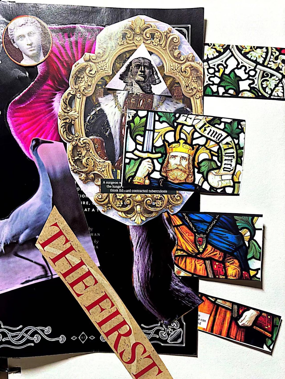
Contrast between classical art and contemporary pictorial forms
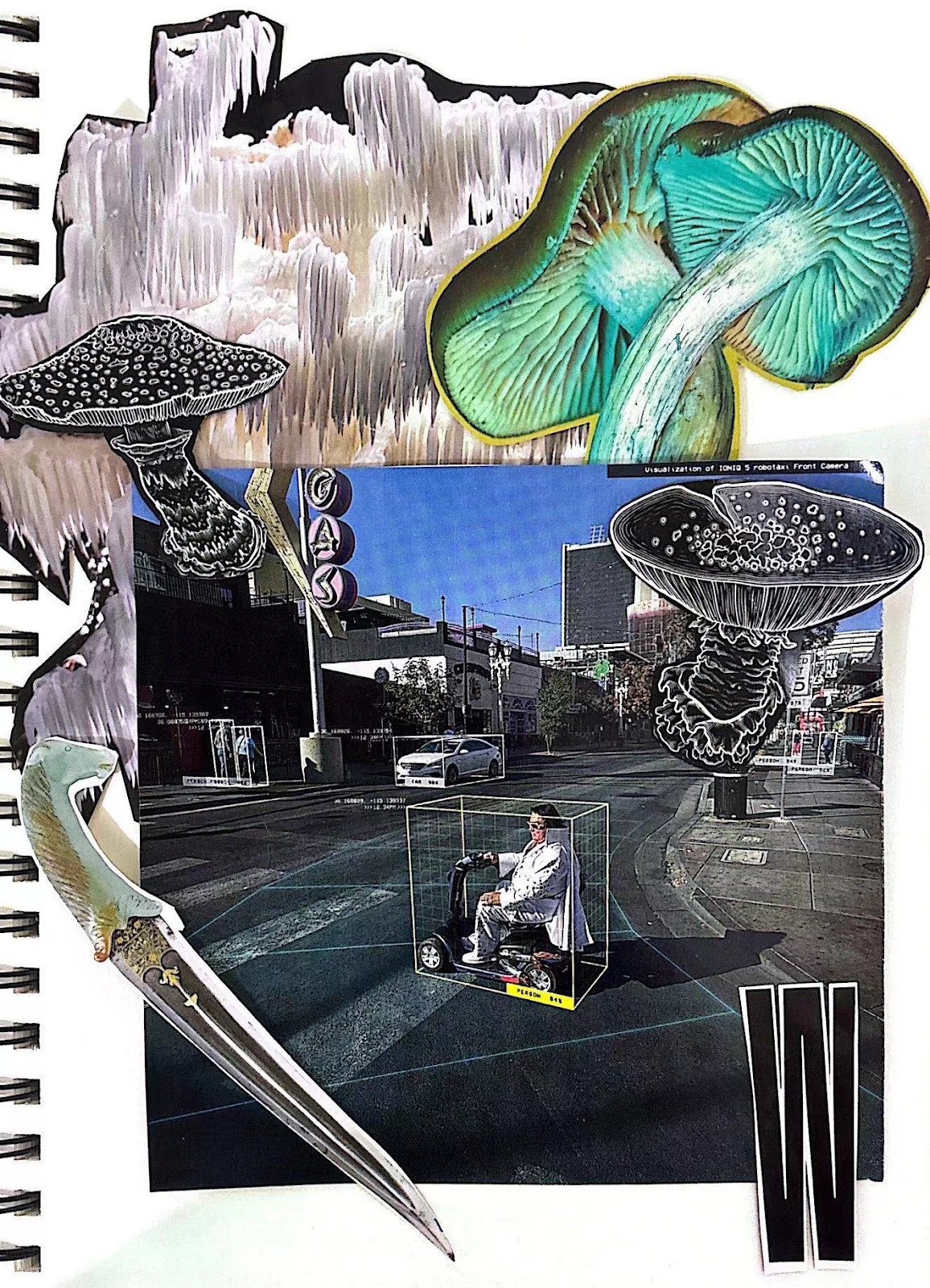
3. PRE-COMPOSITION #3
The fungi in the picture represent the remnants of ancient times in the present era, and the sword represents the collision between the two
In the end, Mr.Yusoff advised me to choose the PRECOMPOSITION#3
Exercise 3(WEEK 3:PRACTICAL COMPOSITING COLLAGE )
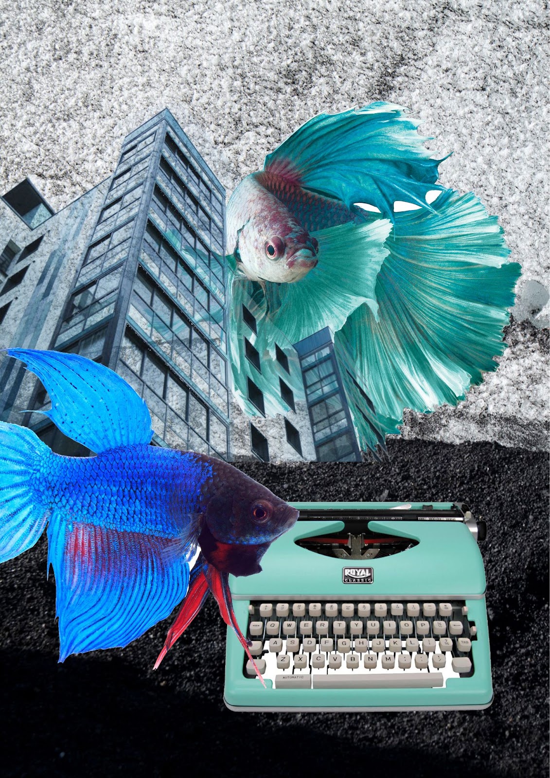
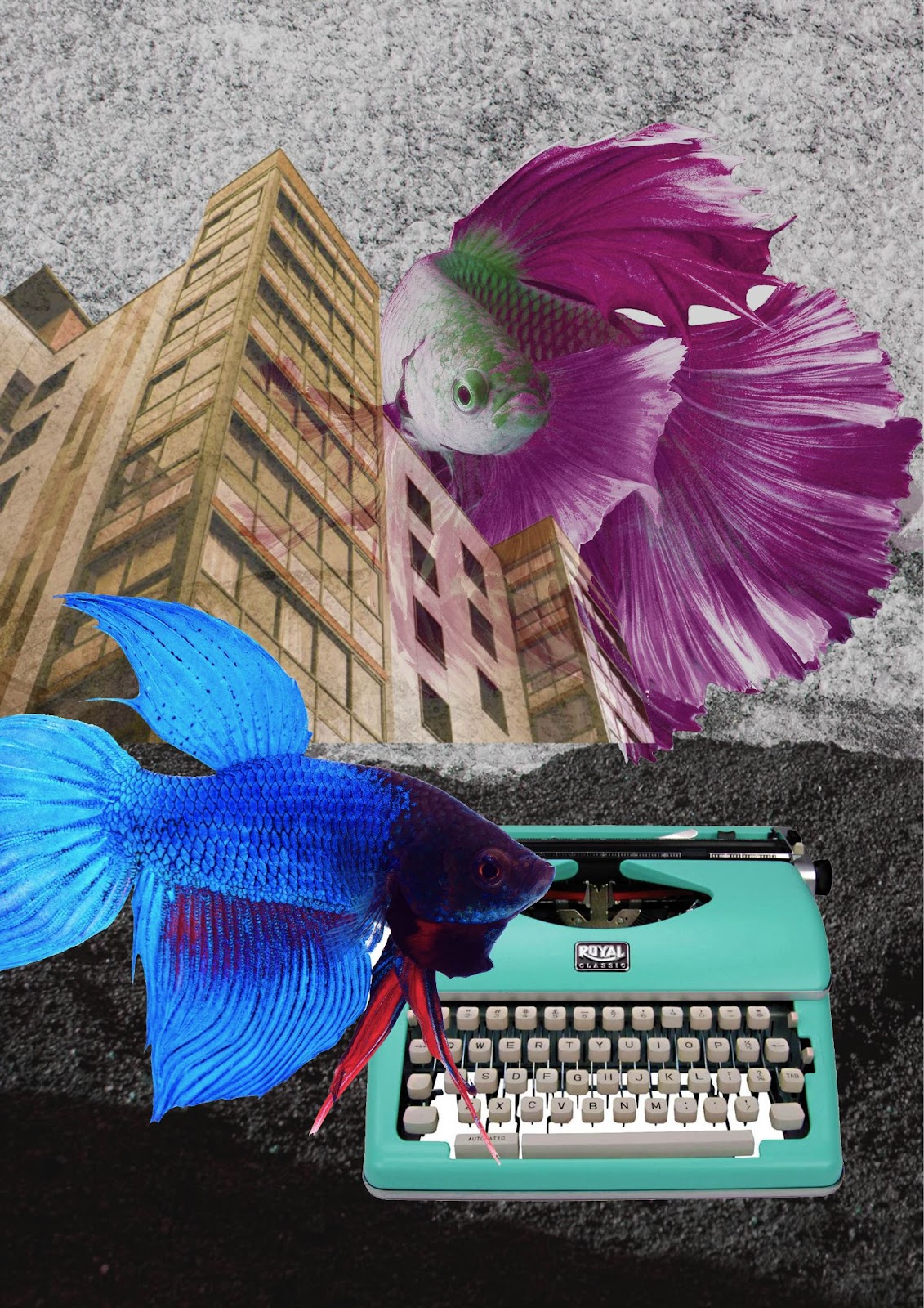
1. COMPOSITION #1
2. COMPOSITION #2
3. COMPOSITION #3
In the end, Mr.Yusoff advised me to choose
the COMPOSITION #1
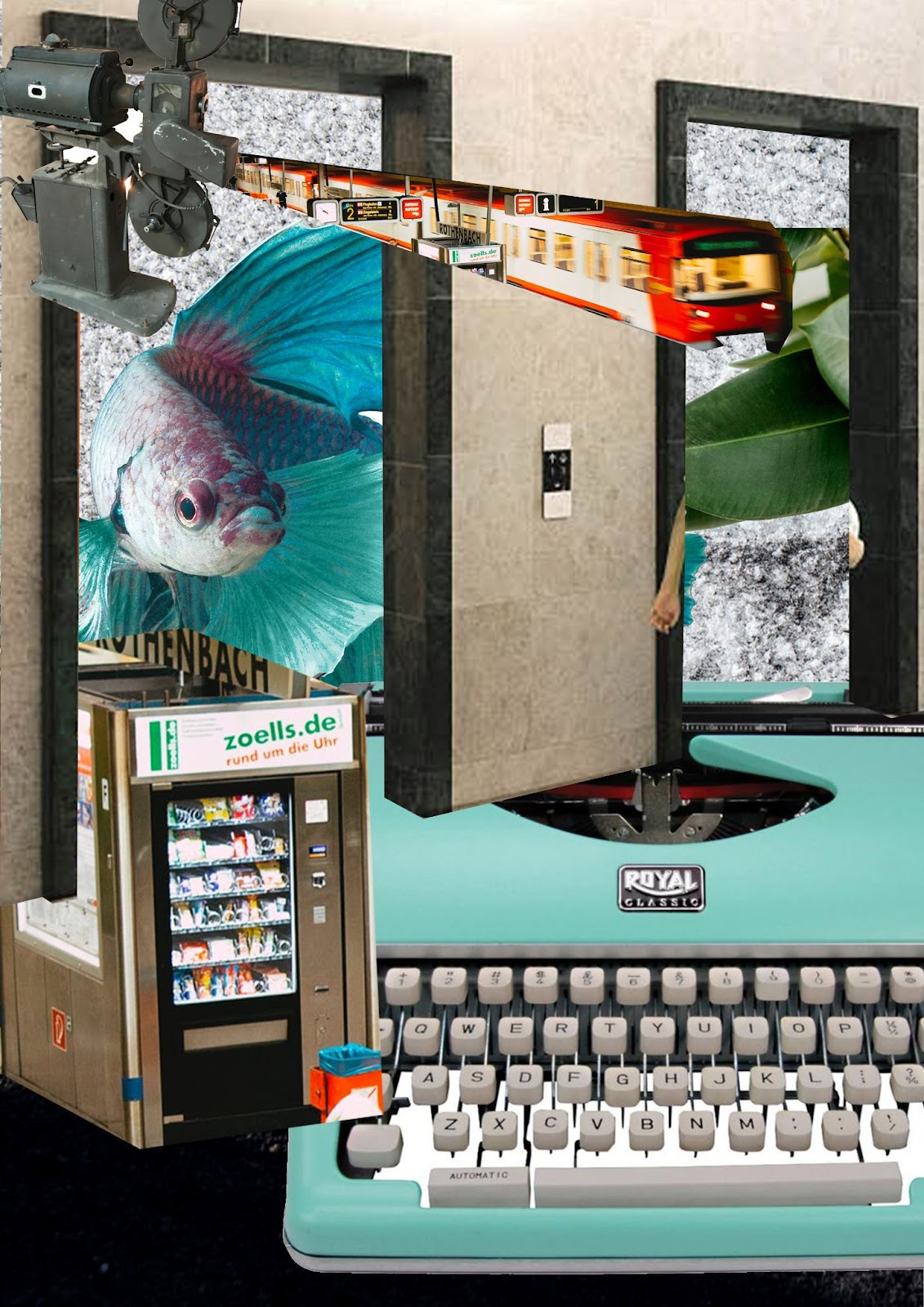
Exercise 4(Week4: PRACTICAL DIGITAL COLLAGE)
1. WEEK 3 - PEN TOOL EXERCISE (BEST COMPOSITION)
DESCRIPTION:
The first time I came into contact with photoshop, I didn't think it was very good. First, I selected some pictures that I liked from the pictures sent by the teacher, and tried to arrange and layout them by using the cropping tool, etc. During the process, there were many problems, so I tried to find the answers in the guidance video. Although the process was very difficult, the result was not so bad
2.WEEK 4 (ADJUSTMENT LAYERS & FILTERS )
DESCRIPTION:
When making a digital collage, the level tool in Photoshop can help me adjust the overall tone, contrast and brightness of the image. Using the level and curve tool allows the collage to make fine adjustments to the brightness, contrast and tone of the image, thus making your digital collage look more vivid and attractive.
FEEDBACK
week1
The first time I took the class, I was full of curiosity about this course, I thought it would be very difficult, but the teacher didn't ask us to do difficult things, just find the works we like, I was a little curious about this course.
week2
In class, the teacher showed us the production process and knowledge of collage. I had contact with it when I was very young, but I did not think it was very interesting. It was not until the teacher said that we could create any form by ourselves that I realized that maybe it was really different and maybe I could open my mind.
week3
The teacher let me choose the first picture and let me try to change the tone and the size of the elements.
week4
The assignment after changing the color tone seems more vivid than the original one, perhaps because the color gap has increased, all in all, I have fallen in love with this course.
REFLECTION
I had never tried collage before and I used to think that collages can sometimes seem boring, but this project proved me wrong. In the process, I learned a lot about the different tools of choice: each lasso tool had its own unique application, I understood the scenarios for the wand tool, and I was fascinated by the way the pen tool operated. Creating these collages was a lot of fun and I used the images provided to explore various collage ideas.


Comments
Post a Comment