Advanced Typography: Task 1 Exercises
Advanced Typography/ Task 1 Exercises
23/9/2024--14/10/2024 (W1-W4)
LIU CHENG RUI (0370930)
GCD 61004 /Advanced Typography / Bachelor of Design (Hons) in Creative Media / Taylor's University
Exercise
TABLE OF CONTENT
1.LECTURES
2.INSTRUCTIONS
3.EXERCISE 1: TYPOGRAPHIC SYSTEM
4.EXERCISE 2: TYPE & PLAY
5.FEEDBACK
6.REFLECTION
7.FURTHER READINGS
LECTURE
week1
AdTypo_1_Typographic Systems
In the first week, we looked at eight different typesetting systems, which
are:
1.Axial System
2.Radial System
3. Dilatational System4. Random System
5. Grid System
6.Transitional System
7. Modular System
8.Biateral System
Then Mr. Viond explained the characteristics of these typesetting systems to
us one by one and how to use the relevant knowledge, as follows:
1.Axial System:There is only one axis, and all elements are placed on the left and
right sides of the axis.
2.Radial System:All elements start from a central focus.
3. Dilatational System:The system will have a center, from which multiple circles
emanate.4. Random System:All elements appear to have no patterns or relationships; each element is an individual.
5. Grid System:A system divided vertically and horizontally.
6.Transitional System:An informal system with layers.
7. Modular System:Turn many elements into standardized units and structure them.
8.Bilateral System:All elements are aligned on an axis.
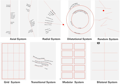
8 examples of Typographic Systems
Week2
AdTypo_2_Typographic Composition
Principles of Design Composition
It mainly describes some methods, such as repetition, symmetry or asymmetry.
Focus on how to apply these principles to typographic layout.
The Rule of Thirds


Example of the rule of third
Typographic Systems
Eight typesetting systems are described, with special emphasis on the
importance of grid systems.
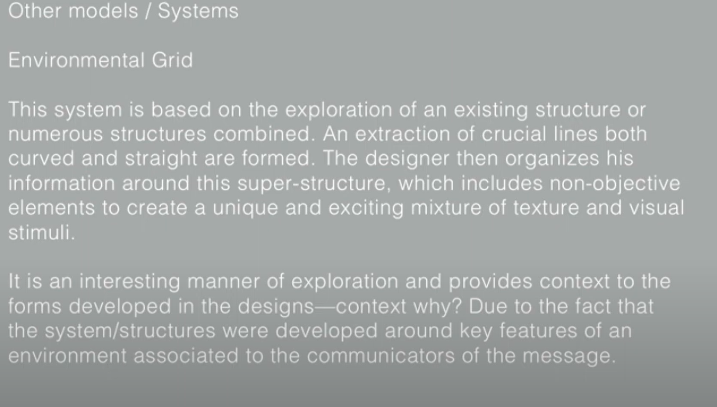
Environmental Grids
The system is based on the exploration of existing structures or
combinations of many structures.

Example of Form and Movement
Form and Movement
The system removes the seriousness surrounding the application of grid
systems.
The placement of a form (whatever it is) on a page, and the creation of
motion on multiple pages, it does not matter whether this page is on paper
or screen.

Week3 AdTypo_3_Context&Creativity

Evolution of the Latin Alphabet

Ancient Egypt Hieroglyphics Chart

The inheritance of typeface design and handwriting style: Early
typeface designers, through research and respect for history, worked to
preserve and recreate historical handwriting styles that were later used
in book printing, allowing the handwriting style to be transformed into a
mechanized printed font.
The impact of the Digital Revolution: With the advent of the
digital Revolution, the West began to digitize many historical typefaces.
Font foundries further the legacy of historic glyphs by creating,
marketing and selling these digital fonts. This importance to historical
typefaces was recognized and became an object worthy of study and
respect.
Colonial impact: The colonial expansion of the West into the East
led to the disruption or stagnation of many Eastern cultures and
traditional practices, including literature, arts, crafts, languages, and
writing systems.

The connection between handwriting and early mechanical type: The first mechanically produced letterforms were designed to directly
imitate handwriting. Studying handwriting helps to understand the
form, spacing, and conventions that mechanical type aimed to
replicate. Handwriting became the foundation or standard for
mechanical type design.
Neglect of Asian/Eastern written heritage: For decades, much of
Asia and the East neglected their written heritage, partly because
they adopted Western printing technologies (such as letterpress,
linotype, and Unicode). Due to the complexity of these technologies,
it required significant know-how, time, effort, and money to recreate
many of the traditional texts in printed form, which made the process
difficult.
A mild renaissance in Eastern typography: With the rise of
computer programmers in large numbers, the East is experiencing a mild
revival in typography. There is now a proliferation of indigenous
scripts on phones, tablets, and computers, bringing renewed attention
to traditional Eastern writing systems.
In summary, handwriting plays a crucial role in the history of type
design, and the East is currently undergoing a revival of its
indigenous scripts through digital means.

murasu.com in Malaysia: Led by programmer and typeface designer
Muthu Nedumaran, murasu.com has successfully cracked the programming
languages needed to code different native writing systems. The system is
now widely used in mobile phones and desktop devices.
Huruf: This is a local group of graphic designers that focuses on
localized typeface design, especially the artistic expression of the Latin
alphabet and local characters drawn or carved on walls and signs. Huruf is
one of the most influential organisations in Malaysia dedicated to
digitisation and revitalising typeface design.
Ek Type and Indian Type Foundry: These two organizations have made
pioneering contributions to the field of indigenous typeface design in
India, driving the development of local writing systems.
Week4
AdTypo_4_Designing Type
In this week's lesson, Mr Vinod tells us about the development of several
design fonts.
1.Adrian Frutiger

Sample font

Sample font
The design goal of the typeface was to create a clean, unique and
easy-to-read typeface that can be easily seen at close and distance, and
is extremely functional.
2.Matthew Carter

Sample font
Many fonts were created in response to specific technical challenges,
such as those posed by early computers.
Take Verdana font (designed by Microsoft in 1996) as an example:
Purpose: The font is adjusted to be extremely readable even at a very
small size on the screen, in part due to the popularity of the Internet
and electronic devices.
Considerations/Limitations: Verdana fonts have features derived from
pixels rather than pens, brushes, or chisels. There are some easily
confused characters, such as lowercase "i", "j" and "l".
3.Edward Johnstan
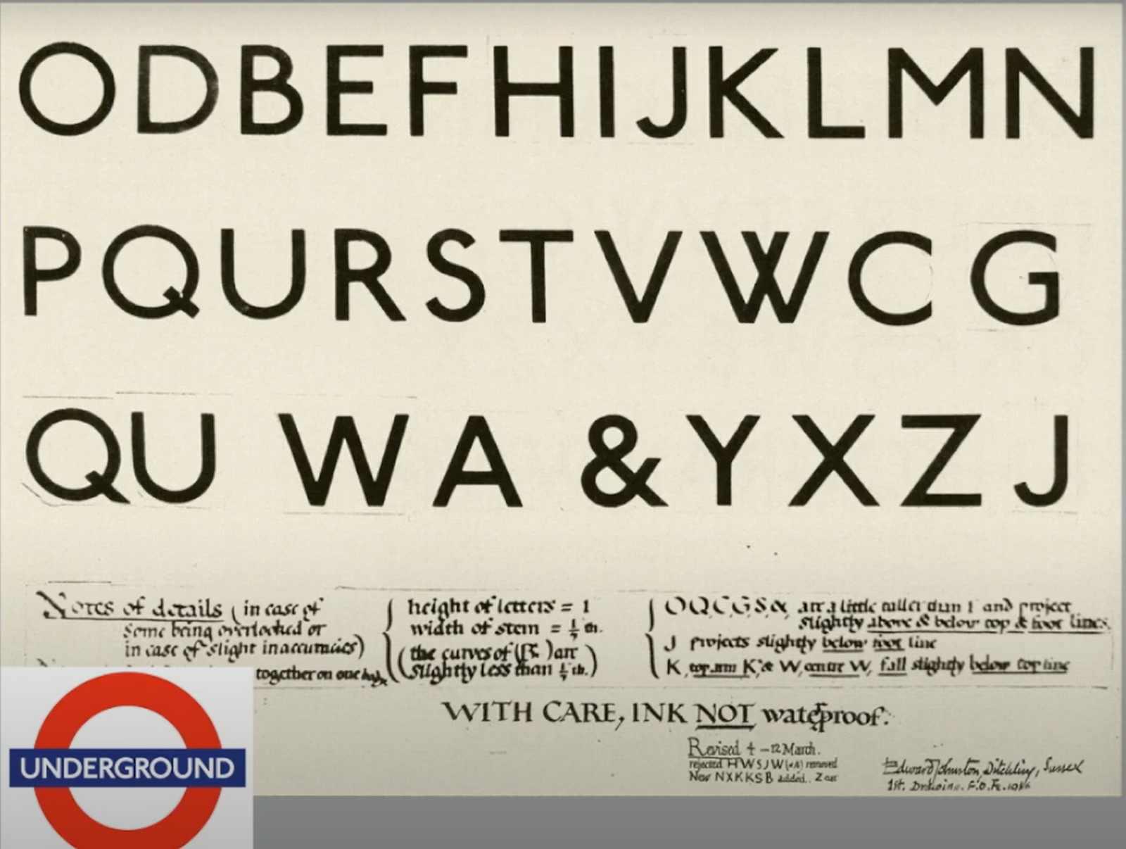
Sample font
The design of the font calls for "bold simplicity", a bold simplicity
that does not completely reject tradition, but incorporates traditional
elements in a modern design.
By taking root in history and traditional calligraphy, the font has a
deep cultural heritage. At the same time, through modern design
techniques, the font is endowed with elegant and concise
characteristics, so that it fully meets the modern aesthetic needs.
General Process of Type Design:
1.Research
1. Understanding of font related knowledge
2. Determine the purpose and use of the font
3. Refer to existing fonts
2.Sketching
Traditional tool drawing emphasizes hand touch and delicate control of
lines, which may be more appealing to designers pursuing a unique
artistic style.
Digital tool rendering, on the other hand, focuses more on efficiency
and convenience, which is suitable for those projects that require rapid
iterative design solutions.
3.Digitization
The emergence of professional font design software such as FontLab and
Glyphs App has provided font designers with powerful tools that allow
them to more precisely control the individual details of a font.
4.Testing
The importance of testing in the font design process cannot be
ignored. Prototyping as part of the test allows designers to simulate
the effect of the font in real application scenarios, so as to get
more intuitive feedback.
5.Deploy
Even after the fonts have been deployed, there may be some unexpected
problems. This reminds designers to be careful and rigorous throughout
the design process, and not to relax the control of quality just because
the font has been released.
Typeface Construction:
Roman Capital's grid construction method provides a structured approach
to font design. Through the use of grids and specific scale
relationships, designers can help establish a uniform font style and
ensure the coordination and consistency of letter shapes.

Construction grid for the Roman
Capital using 8 x 8 cells.
Construction and considerations:
In the form and construction of the font, the visual correction of the
curved and protruding parts beyond the baseline and capital line is
proposed, and the importance of vertical alignment between the curved
and straight forms is emphasized.
In terms of letter spacing, letters cannot simply be arranged
equidistant. Instead, it is necessary to carefully adjust the visual
blank space between the letters, that is, to make the "white space"
between the letters look the same.

Fitting example
INSTRUCTIONS
EXERCISE
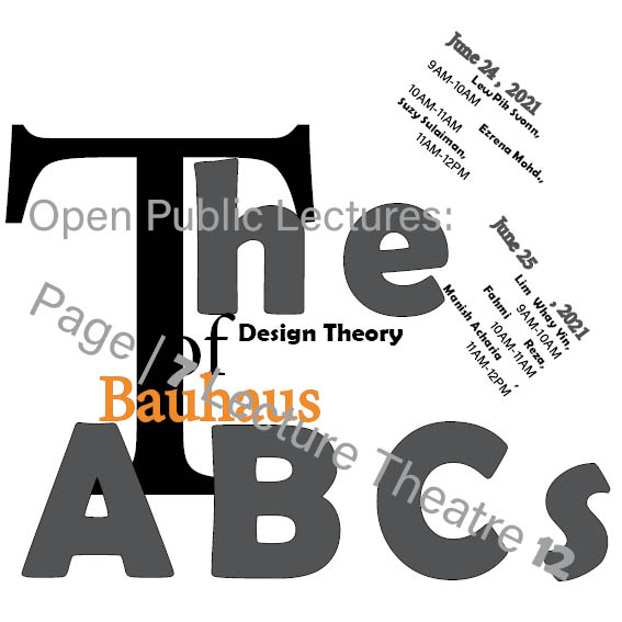
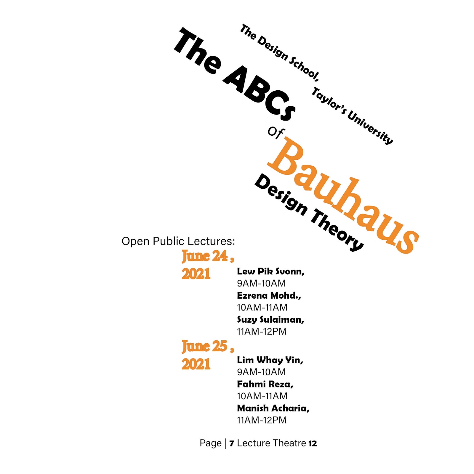
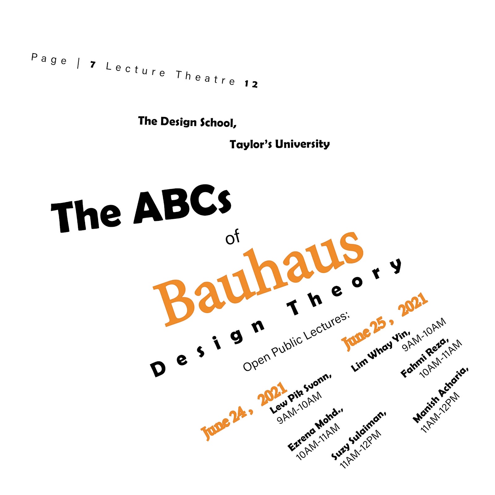
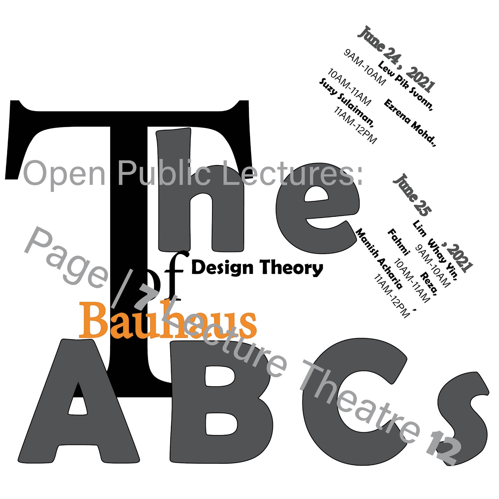
Task 1: Exercise 1 - Typographic Systems
attempt

axial typographic system attempt
radial typographic system attempt

Dilatation typographic system attempt

grid typographic system attempt

Bilateral typographic system attempt
Random typographic system attempt

Transitional typographic system attempt
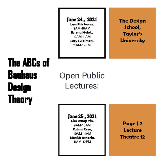
This is my first attempt at a typesetting system
In the feedback. Mr. vinod approved of my expansion system, but I
had some problems with my grid system, and Mr. vinod pointed out
that my subheadings were too close to the text, which was not
comfortable. Also, the most important thing was that my radial
system did not extend to the same central point, which was incorrect
and I modified it.
In addition, the black border of my Modular typographic system is
too thick, and Mr. vinod suggested that I make it
slightly thinner.
Final axial typographic system

Final Dilatation typographic system


Final Bilateral typographic system
Final Random typographic system

Final Transitional typographic system

Task 1 - Exercise 1: Typographic Systems - PDF, Week 2
Task 1 - Exercise 1: Typographic Systems Grids and Guides - PDF, Week 2
Task 1: Exercise 2 - Type and Play
we were asked to find type from a picture that we choose, it can be
nature, manmade things or the structure of the building. We need to create
5 letter form.
I first found some images on Pinterest and tried to find some useful
information to use as my original letters.


Photo reference2
I then tried to find some useful information from the two
pictures and tried to
outline the lines of the letters.

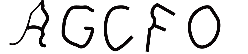
Attempt 1
In the first attempt, I extracted two different forms of A,
and eventually I chose the A on the right as my extraction
letter.

Eventually, I chose to try 1 as my initial letter.

Extracted letter

The letters on the baseline

Reference font
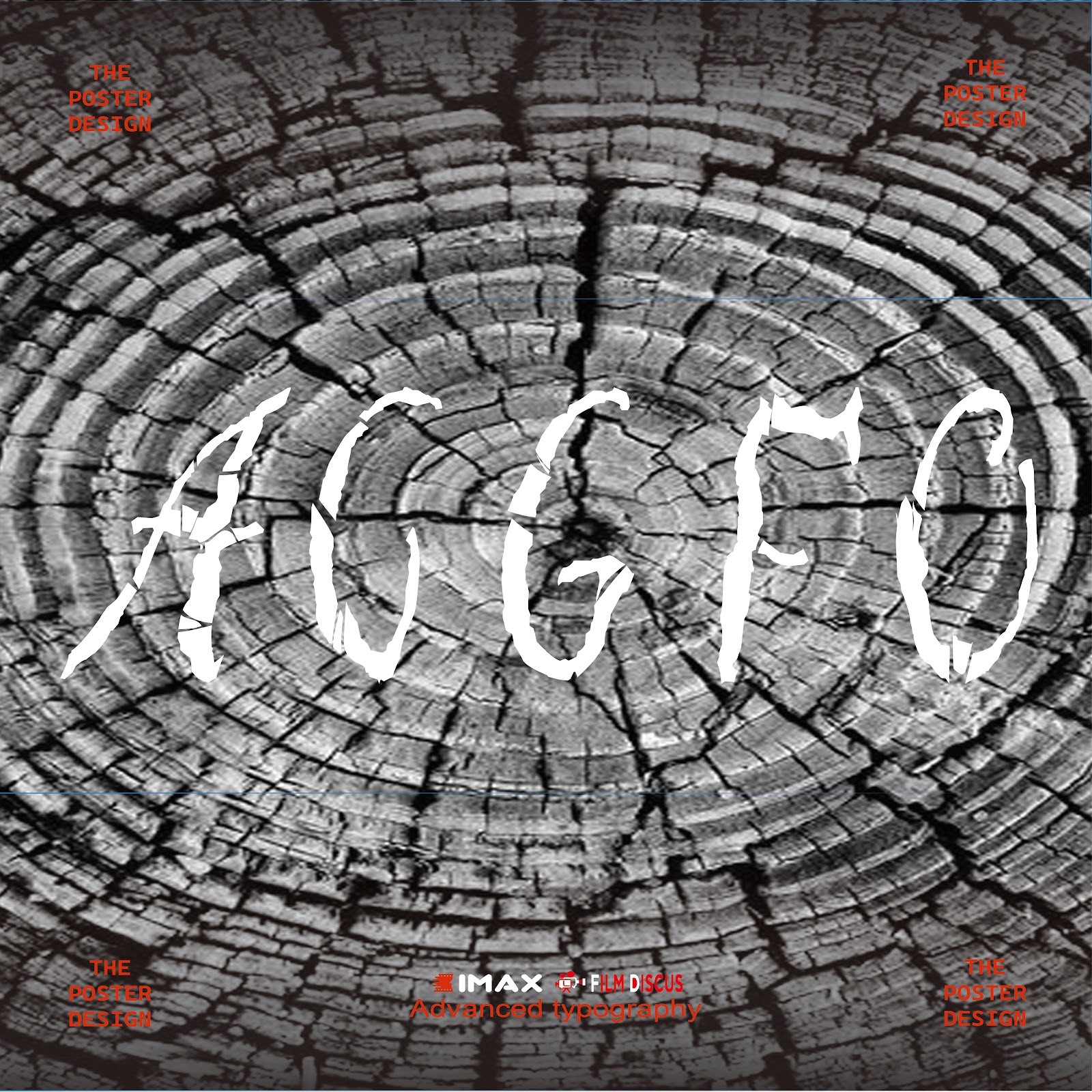
Since my extracted letters are derived from the rough lines of trees, my
typeface design is more of a pothole feel.
Because it gives more of a tree-like texture.

First evolution

Third evolution

Final font

The final font on the baseline

In the class, Mr. Vinod thought that my font design was correct, but
it lacked some representativeness and could not properly extract the
features of the pictures. Mr. Vinod suggested that I increase the
inner lines of the font like cracks in trees, which might be better.

Overall Process, Week 3

Image and Extraction

Extracted Letterforms on baseline


For the exercise of the poster, Mr. Vinod told us that it is not
necessary to use the original picture to extract letters, as long as
the object extracted from the original picture is the same, so I
chose the following picture.

I chose to make my font red because it looks more striking.

Font color change
In addition to this, I also made the image as the background of the poster
a black and white tone, which helps the visual center stay on top of the
font and not scatter.

Background color change

The process of making posters

final poster
Class feedback about Mr.vinod in Week 4
In the fourth week of class, Mr.vinod gave me the following suggestions
for revising my homework of the previous week:
1. It is better to change the color of the font in the center of the
poster from red to white.
2. Add a black gradient to the top and bottom of the poster to make the
effect more obvious.
3. Shrink the small text in the poster, it's too big.
4. Add the movie LOGO.
After that, Mr.vinod helped me with the revision and I got the new
poster.
The revised poster
Finalized Poster (PDF), Week 4
FEEDBACK
week1
General feedback:
In the first week of the course, Mr. Vinod introduced to us the matters that
need to be paid attention to and some requirements in the advanced layout
course, such as we should update our task progress and feedback in time, which
is very necessary.
In addition, it also introduces the relevant knowledge about the composition
system exercise.
Specific feedback:
After class, use InDesign to design the sketches of the eight typesetting
systems discussed in class and upload them.
week2
General feedback:
We got an important briefing for the next exercise 2.
We will be asked to choose images of man-made objects (chairs, glass,
etc.) or structures (buildings) or things in nature.The font modification
process should be provided at the time of submission.
In addition to this, Mr. VINOD also asked us to have no less than five
fonts, which is very important.
Specific feedback:
In class, Mr. vinod gave me feedback on last week's work, in which Mr.
vinod approved of my Dilatation typographic system, but there were some problems with my grid system. Mr. Vinod pointed out
that my subheadings were too close to the text, which was not
comfortable.
In addition, the most important thing is that my radial system does
not extend to the same central point, which is incorrect.
week3
General feedback:
In this lesson, Mr. Vinod evaluates our font extraction and evolution work
for the second week and explains the tasks for the next week.
Specific feedback:
In the class, Mr. Vinod thought that my font design was correct, but it
lacked some representativeness and could not properly extract the features
of the pictures. Mr. Vinod suggested that I increase the inner lines of
the font like cracks in trees, which might be better.
week4
General feedback:
In this week's lesson, Mr. Vinod gave us comprehensive feedback
on task1, and for the first time, Mr. Vinod also told us about
task2. My first impression of task2 was that it was more focused
on creating our own logo, which was new to me.
Specific feedback:
In the fourth week of class, Mr.vinod gave me the following
suggestions for revising my homework of the previous week:
1. It is better to change the color of the font in the center
of the poster from red to white.
2. Add a black gradient to the top and bottom of the poster to
make the effect more obvious.
3. Shrink the small text in the poster, it's too big.
4. Add the movie LOGO.
After that, Mr.vinod helped me with the revision and I got the
new poster.
REFLECTION
Experiences
In the two exercises of Task 1, I think I gained a lot of new knowledge
about typography. For example, in Exercise 1, each of the eight
typesetting systems has its own unique usage and expression, among which
the Grid system structure is more inclined to a neat arrangement, while
Random is more inclined to a random layout.
In Exercise 2, I experienced the evolution process from the initial
extraction of letters to the final one. In this process, I think the most
important final letter should reflect the features of the original
picture, that is, the representation. In my design, for example, it is
necessary to observe more small gaps in trees.
Observations
In these two exercises, I observed that in order to design a good
typesetting format, it is not only necessary to have an excellent layout,
but more importantly, to pay attention to the in-depth level of
typesetting. For example, the random layout system in Exercise 1, although
it is a random arrangement, if you do not deal with the deeper structure,
the end result will only look very simple, more like a clueless pile.
In exercise 2, the problem of hierarchy is manifested in the extraction of
small letters, because in the extraction process, it is necessary to find
the objects that look like letters, but also pay attention to the
hierarchical relationship with the surrounding pictures, and do not
deliberately destroy their inherent hierarchy in order to extract letters.
Findings
In Exercise 1, I discovered that each system has its own unique
representation, and the Bilateral system needs a neat arrangement. The
Dilational system allows us to exert the ability of independent innovation
to explore and create new layouts to a certain extent. But we also need to
be careful not to forget the requirements of each system while innovating.
In exercise 2, I found that it seems that the extraction of letters does
not need to adhere to the rigid idea, that is, the appearance of letters
must be exactly the same or very regular. On the contrary, we can
independently depict their shapes, and their shapes can also be very
distorted. These differences enrich the form of typesetting to some
extent.
FURTHER READING
week1

About introduction
Vignelli on Design is divided into the following chapters:
Philosophy of design
Design and function
Visual language
Color and typography
Cross-domain design
Classic case study
Designer's responsibility
Business and Design
The future of design
In this chapter, Vignelli articulates the core principles of design,
such as simplicity, functionality, and visual clarity. He emphasized
that design is not only the expression of form, but also the process of
solving problems. After reading, I have a deeper understanding of the
concept of "simple is beautiful". This kind of thinking encourages me to
always think clearly when facing complex projects and remove superfluous
elements in order to convey the most core message.
week2
In the second chapter of Vignelli on Design, "Design and Function",
Vignelli emphasized that the core of design is function, not just
beauty. His point got me thinking about a few key points:
Function first: Design should be centered on user needs to ensure
practicality.
Simplicity matters: Simplifying your design improves the user
experience and avoids confusion.
User experience: Design needs to focus on the convenience of user
operation.
Emotional connection: The design should also consider the user's
emotional response.
Practical application: Always balance function and beauty in future
design.
Overall, this chapter deepens my understanding of the value of design
and emphasizes the art of problem solving.
week3
The third chapter, "Visual Language", explores how visual
elements in design construct and convey information. In Vignelli's
design philosophy, visual language is not just for aesthetics, but
as a tool to convey information.
1.According to Vignelli, the designer's task is not just to
"decorate" a message, but to make it easier to convey in a
rational, intentional way.
2. Systematization and sense of order Vignelli places great
emphasis on the sense of order in the design. He believes that
visual languages have structure and rules, and these rules help
design become more effective.
The third chapter makes me more deeply understand that the
"visual language" in design is not only about form, but also about
function and communication.
week4
Chapter 4, "Color and Typography," discusses the role of color and
typography, two key elements in design.
The emotion and functionality of color: this part makes me deeply feel
the multi-dimensional role of color in design. Color not only brings
visual appeal to the design, but more importantly, it affects the user's
experience and feelings through psychological suggestion and emotional
association. For example, red is often associated with tension and
warning, while blue conveys calm, trust and other emotions.
The choice of fonts and the power of typography: Fonts are a "language"
in design, conveying not only the content of the message, but also the
style and attitude of the design. Vignelli has always been a fan of
minimalist typefaces, especially those with classic and enduring appeal,
sans serif typefaces such as Helvetica.


Comments
Post a Comment