Advanced Typography: Task 3 Type Exploration & Application
Advanced Typography/ Task 3 Type Exploration & Application
23/9/2024--14/10/2024 (W1-W4)
LIU CHENG RUI (0370930)
GCD 61004 /Advanced Typography / Bachelor of Design (Hons) in Creative Media / Taylor's University
Exercise
TABLE OF CONTENT
1.LECTURES
2.INSTRUCTIONS
3.EXERCISE 1: TYPOGRAPHIC SYSTEM
4.EXERCISE 2: TYPE & PLAY
5.FEEDBACK
6.REFLECTION
7.FURTHER READINGS
LECTURE
no lecture
INSTRUCTIONS
EXERCISE
We were asked to do font design explorations, which could be aspects of
interest to us, and present them in the form of google slideshows.
Slide presentation week8(13/11/2024)
In this week's class, Mr.vinod suggested that I use the last slide of the
slide as a reference for my font design, which I designed in Task1.
reference week8(13/11/2024)
Change process week9(20/11/2024)
In class this week, Mr. Vinod approved my capital letter design and asked
me for a new requirement that the height of the Y should be the same as
that of the left and right sides.
Modified letter Y week10(27/11/2024)
In class, Mr. Vinod asked me to design a three-letter lowercase ABC
first and then show it to him, in Mr. Vinod's opinion. These lowercase
letters should have their own correct size, not too small or too
big.
The letter ABC classroom design week10(27/11/2024)
The first attempt at lower-case font design week10(30/11/2024)
The first attempt at punctuation font design week10(30/11/2024)
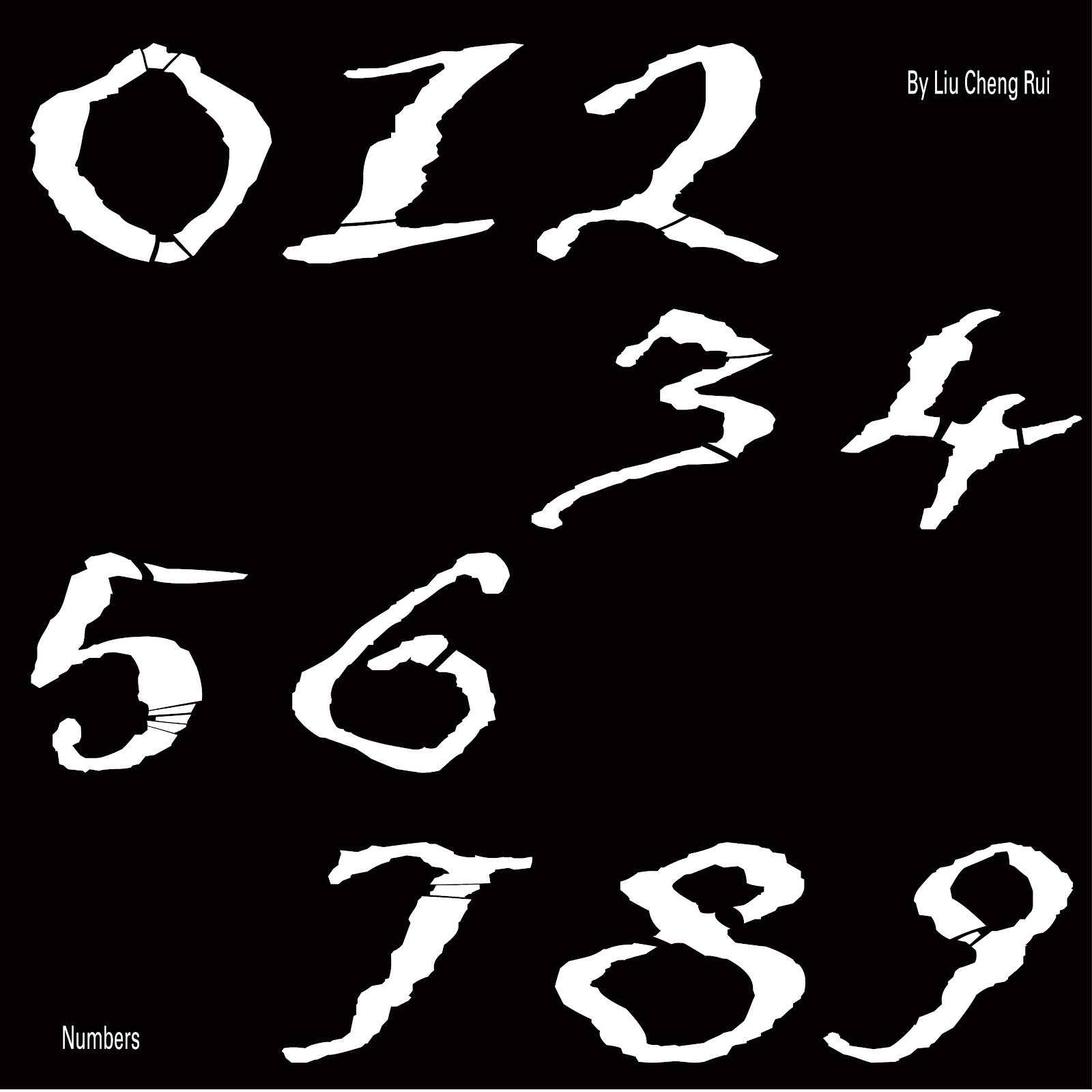
The first attempt at digital font design week10(30/11/2024)
In the 11th week of class, I showed my font design to Mr. Vinod, who
thought everything was OK, but the font size was all too small, and
showed me that the correct size should be on the canvas of
1000pt×1000pt.
Example of correct size week11(4/12/2024)
Then, under the guidance of Mr. Vinod, I resized my fonts and placed
them above the guides.
Numbers on the reference line week11(4/12/2024)
Punctuation on the reference line week11(4/12/2024)
First, I import each letter into the resource export tool, and then
export it in SVG format.
Font import week11(4/12/2024)
When making lowercase letters, the lower ends of some letters are different from the lower ends of others, so I used the Element > Transformation > Move and Scale tool to adjust the overall size and position.
Adjust font size and height week11(4/12/2024)
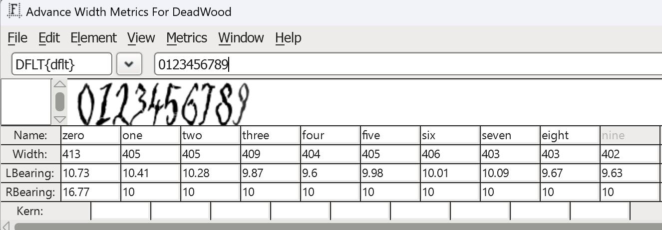
Complete the font import in FontForge
Distance adjustment
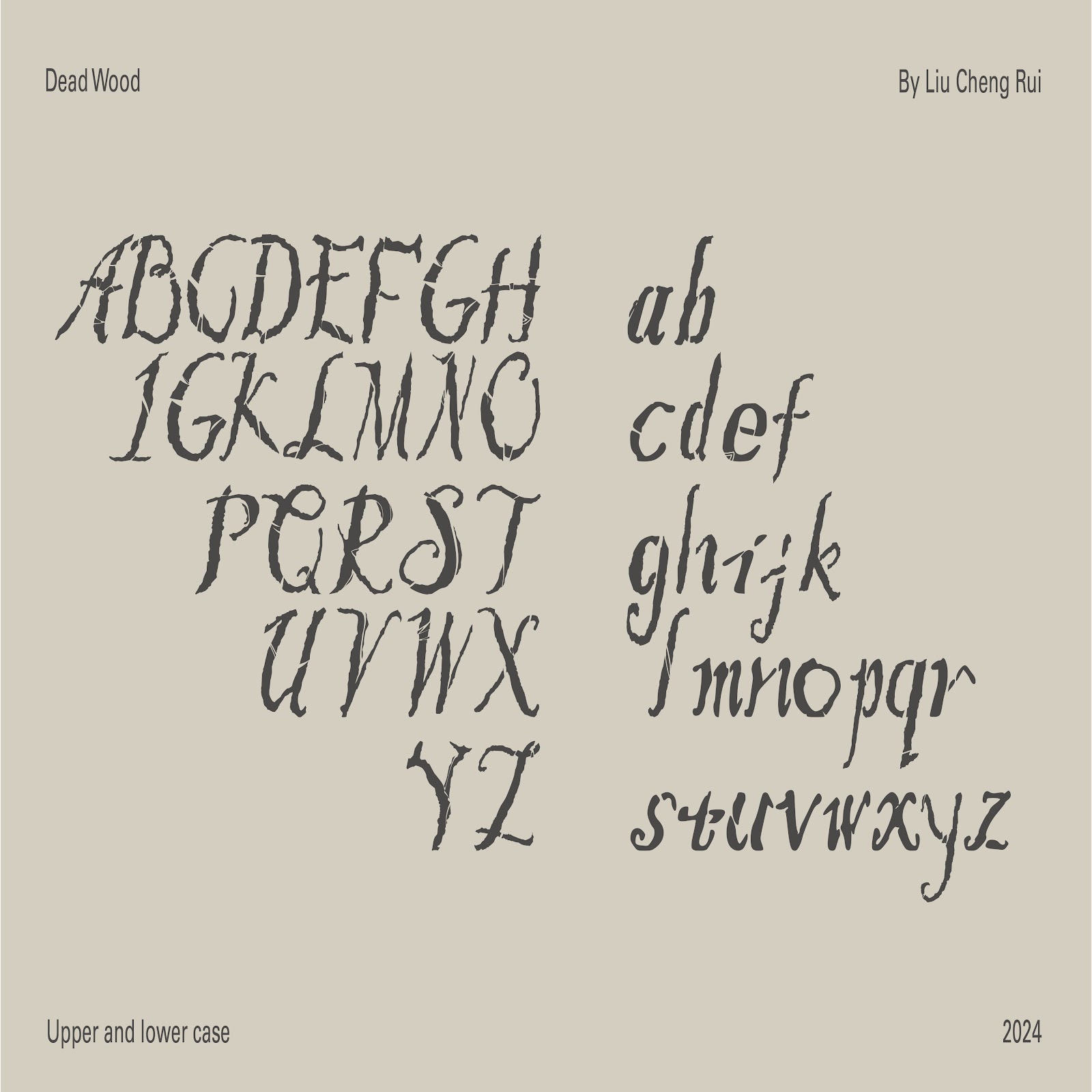
Font Presentation
Before the task begins, I first find a color palette that I like to
use as a color match for my text presentation artwork.
color palette week11(6/12/2024)
Font Presentation for the first time (1) week11(6/12/2024)
Font Presentation for the first time (2) week11(6/12/2024)
Font Presentation for the first time (3) week11(6/12/2024)
Font Presentation for the first time (4) week11(6/12/2024)
Font Presentation for the first time (5) week11(6/12/2024)
First attempt at text presentation artwork week11(6/12/2024)
First of all, in the first picture, Mr. Vinod suggested that I
reduce the font in the four corners and change the font (the same
applies to the next four pictures).
As for the photo below, Mr. Vinod thinks that the contrast
between the background and the font is too weak, and suggests
that I delete the background or make a new one.

In the end, I prefer to use this staggered arrangement to
complete my work.
Modified parts week12(11/12/2024)
After modification, the following new works are obtained.
Modified font presentation 5 week12(11/12/2024)
Font Application
In the preparatory work of making font application, I
expected to design according to my original intention of font
design, that is, to appeal to people to reduce the felling and
destruction of trees, so I would like to design an activity
calling on people to protect trees, and launch the following
products, billboards, event tickets, event magazines and event
badges according to the activity.
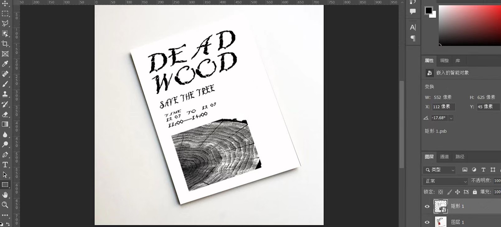
I chose to use AI and PS software to do this, and here are
some screenshots of the process.
Complete font application
Task 3 Final Outcome
Final Font Design
Finalized letterforms (PDF), Week 13(17/12/2024)
google drive download link:
Direct download link for fonts:
Final Font Presentation artworks
Modified font presentation 5 week12(11/12/2024)
Final Font Presentation ( PDF ) Week 13 (17/12/2024)
Final Font Applications
FEEDBACK
Week9
General feedback:
In this lesson, Mr.vinod first reviewed our Task2, I also asked Mr.vinod
for advice on optimizing my GIFs, and in the second half of the lesson,
Mr.vinod commented on our exploration of typeface design slides.
Specific feedback:
Task2:
Key artworks passed, but there are problems in the giFs, giFs should
mainly show the design of the font LOGO and should not add too much
other animation.
Task3 Font exploration slideshow:
You can choose the font design in Task1 and extend it to serve as a
warning for those who want to talk about tree felling.
Week10
General feedback:
This week, Mr. Vinod reviewed and suggested changes to our
uppercase work, and asked us to continue working on lowercase
letters and punctuation.
Specific feedback:
Mr. Vinod approved my capital letter design, but there are
some shortcomings, such as the left and right height of the
letter Y should be the same, so that it looks more
beautiful.
Week11
General feedback:
This week, Mr. Vinod gave us feedback on the design of upper
and lower case letters and punctuation, and
explained that we need to start the font
presentation and font application planning before
the next week.
Specific feedback:
Mr. Vinod pointed out that my upper and lower case
letters and punctuation marks were not the right
size and should be placed on the 1000pt×1000pt
canvas, in addition to paying more attention to the
spacing and height of some letters to ensure
similarity.
Week12
General feedback:
Because Wednesday is a public holiday, Mr. Vinod used
a quick online feedback session to give feedback on
the work of the participants.
Specific feedback:
Mr. Vinod mainly gave me feedback on my font
presentation assignment. First of all, the font in the
four corners of the manuscript was too large. Mr.
Vinod suggested that I switch a font and reduce the
font. The second is that the background color of a
manuscript and the font color contrast is too weak, it
is recommended to delete.
Week13
General feedback:
Mr. Vinod reviewed our task3 font presentation and
font application and explained the submission
requirements for task3 and the final task.
Specific feedback:
Task3's font presentation and font application are
complete.You can continue with the final
compilation.
REFLECTION
Experiences
In my opinion, this task covers many aspects of the first two
tasks, such as font presentation and font application, but it is not
exactly the same. For this task, I was introduced to a new font
import tool, fontforge, which is similar to the previous fontlab in
most of its functions, but fontforge requires SVG imports. This
process really took a lot of time and effort, and I had to adjust
the size of each character to make it look more comfortable.
However, after I completed this series of operations, trying new
methods did give me a lot of unexpected results.
Observations
Working with FontForge has made me more aware of the value and
potential of this new tool: it provides a low threshold starting
point for users who want to explore font design, while also
demonstrating powerful functionality. However, its operational
complexity reminds me that the choice of design tool needs to be
weighed against the actual needs and level of technology. After
this period of time, its existence has brought me some new
growth.
Findings
In this task, I found that font design is a combination of
function and aesthetics. When creating a new font, the letter
shape must not only be aesthetically pleasing, but also ensure
clear readability, especially in different sizes and scenarios.
The second is the importance of detail, and small changes in each
node and anchor point will affect the overall balance of the font.
Especially in curvilinear designs, being too smooth or too sharp
can break the consistency of the font.
In general, the process from design to application of fonts is not
only a technical task, but also a carrier of culture, emotion and
communication. We need to experiment and practice in our creation
in order to create fonts that are both technical and expressive,
and effectively apply them to different scenarios.
FURTHER READING
| Twentieth-century type: Remix by Lewis Blackwell |
《Twentieth Century Type: Remix》 is a book by Lewis Blackwell that focuses on the development and transformation of typography and type design in the 20th century. This book explores how typeface design has evolved with social, cultural, and technological advances, and introduces many classic typefaces, designers, and milestones that have influenced design trends.
1.Introduction: Type and Typography
2.The Birth of Modern Typography
3.Type and Technology
4.The Typeface Revolution
5.Postmodernism and Typography
6.Digital Type and Desktop Publishing
7.Type in the Digital Era
8.Globalization and Diversity in Type Design
9.The Future of Typography
Week9
The first chapter of Type and Typography in Twentieth Century Type:
Remix sets the tone for the whole book. By introducing the basic
concepts, historical background and cultural significance of
typeface design, I have a comprehensive and profound understanding
of the role of typeface. This chapter emphasizes that fonts are not
only visual elements, but also the result of the intersection of
cultural, technological, and social needs.
The first chapter succeeded in arousing my interest and awe for
typeface design. I realized that it is not only a record of
technological evolution, but also a microcosm of social and cultural
evolution. The biggest gain from reading this chapter is that I am
more aware of the profound influence of font design on our lives in
silence, and I am more willing to savor the history and significance
behind each font.
Week10
This chapter deeply reveals the origins of modern typography and
gives me a clearer understanding of the history of typeface design.
Through a discussion of the evolution of typeface in the late 19th
and early 20th centuries, the book highlights the revolutionary
influence of the modernist movement on typeface design, particularly
the role of the Bauhaus School.
For me, the most impressive part is how modernism combines
"functionality" with "aesthetics", challenging the luxury decorative
style of traditional typographic design.
In general, The Birth of Modern Typography not only makes me
understand the birth background of modern typography, but also makes
me realize that typography is not only an artistic creation, but
also a product of social, cultural and technological changes.
Week11
In the chapter "Type and Technology" of Twentieth Century Type:
Remix, Lewis Blackwell explores how type design has changed with the
development of technology. After reading this chapter, I deeply felt
the tremendous impact of technological progress on font design. The
proliferation of desktop publishing technology, in particular, has
revolutionized the way designers work, offering greater creative
freedom and flexibility.
In addition, this chapter also made me realize that the relationship
between technology and design is not one-way. The creativity of
designers drives the development of technology, which in turn
constantly provides new possibilities for design.
Overall, this part of Blackwell gave me a deeper understanding of
the technical background of font design, and also made me realize
the important relationship between technology and creativity.
Week12
The chapter "The Typeface Revolution" reveals an important
transformation in the field of typeface design in the 20th century,
from a purely functional tool to a medium for cultural, artistic, and
emotional expression. Driven by social movements, technological
progress and artistic trends, typeface design breaks through
traditional rules, emphasizes individuality and diversity, and emerges
a large number of expressive and subversive typeface styles. This
change not only reflects the spirit of The Times, but also highlights
the unique position of font design in cultural communication.
Week13
The influence of postmodernism on font design has profoundly changed
my understanding of design rules and expressions. It made me realize
that font design is not only the pursuit of unity and functionality,
but also a tool used by designers to express personality, emotion
and culture. This deconstruction and reorganization of traditional
rules made me reflect that "mistakes" in design may sometimes be the
starting point of innovation.
This chapter gives me a new understanding of the freedom and
diversity of design, and encourages me to bravely break through the
framework and pursue more profound and meaningful creation in the
future design practice.


Comments
Post a Comment