VIDEO & SOUND PRODUCTION/(Project2)
VIDEO & SOUND PRODUCTION/(Project2)
Liu Chengrui (0370930)
What is color grading?
Now, color grading is the next step, and this is where you can actually begin to create the aesthetic of your videos.
However, the right color grading will always help convey a visual tone or mood to heighten the narrative.
Normalize your folate as much as possible.
Follow the steps to correct your colors.
Choose your desired look and style.
Make your color adjustments in your editing program of choice.
Double check skin tones and vectorscope.
Color grading before and after
Color grading is often what one thinks about when color editing where the differences in the before and after examples can be quite extreme.
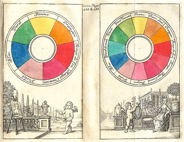
1.A scientific principle that explains how color hues and saturations are created.2.A creative discipline that examines how color is used to achieve emotional effect in visual art.Types of Color Theory:Color WheelOriginal colors are red, orange, yellow, green, blue, indigo, and violet, perhaps better known by the acronym ROYGBIV. Compounded colors are colors that are created by, you guessed it, compounding original colors.
Monochrome utilizes varying tones of just one color (usually gray).
Analogous utilizes colors that are next to each other on the color wheel.
Complementary utilizes colors that are colors that are opposite to one another on a color wheel.
Triadic color utilizes colors that connect together on a color wheel to form an equilateral triangle.
Tetradic color utilizes colors that connect together on a color wheel to form a rectangle.
Color Harmony in Film
Kubrick’s color style relies on saturated reds and blues to communicate thematic tone.
Zack Snyder is considered by some an auteur of modern filmmaking, in large part due to his use of color.
Snyder’s color style effectively uses monochrome cross-matched with complimentary color to create a style all its own.
Guillermo del Toro utilizes a wide range of approaches to color in his works.
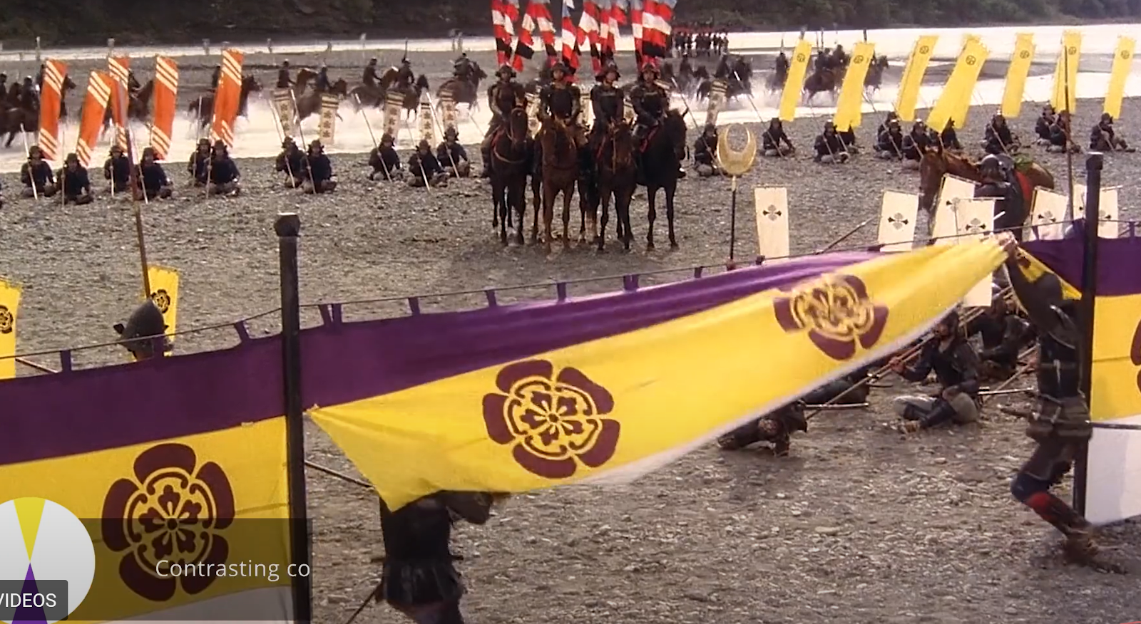
Guillermo del Toro’s color style is certainly varied, but triadic color is seen often. Look out for that “yellow/red/purple” look in films like Pacific Rim.Kurosawa’s color style, at least in a later sense of his career, is perhaps best exemplified in the deep, saturated reds of Throne of Blood and the complementary/triadic schemes of Dreams.
Anderson’s color style is loud and audacious, which creates magically-realist film worlds that never quite match the visual bleakness of our own.
Quiz:
Week 6 (29/10/24) Asynchronous class materialsMise en scène is a French term that translates literally to "placing on stage." In the realms of theater, film, and other visual storytelling mediums, it refers to the overall visual arrangement and presentation of a scene. This concept encompasses everything that appears within the frame or on stage and how these elements are organized to convey meaning, emotion, and narrative to the audience.
Monochrome utilizes varying tones of just one color (usually gray).
Analogous utilizes colors that are next to each other on the color wheel.
Complementary utilizes colors that are colors that are opposite to one another on a color wheel.
Triadic color utilizes colors that connect together on a color wheel to form an equilateral triangle.
Tetradic color utilizes colors that connect together on a color wheel to form a rectangle.
Color Harmony in Film
Kubrick’s color style relies on saturated reds and blues to communicate thematic tone.
Zack Snyder is considered by some an auteur of modern filmmaking, in large part due to his use of color.
Snyder’s color style effectively uses monochrome cross-matched with complimentary color to create a style all its own.
Guillermo del Toro utilizes a wide range of approaches to color in his works.
Guillermo del Toro’s color style is certainly varied, but triadic color is seen often. Look out for that “yellow/red/purple” look in films like Pacific Rim.
Kurosawa’s color style, at least in a later sense of his career, is perhaps best exemplified in the deep, saturated reds of Throne of Blood and the complementary/triadic schemes of Dreams.
Anderson’s color style is loud and audacious, which creates magically-realist film worlds that never quite match the visual bleakness of our own.
Mise en scène is a French term that translates literally to "placing on stage." In the realms of theater, film, and other visual storytelling mediums, it refers to the overall visual arrangement and presentation of a scene. This concept encompasses everything that appears within the frame or on stage and how these elements are organized to convey meaning, emotion, and narrative to the audience.
Key Components of Mise en Scène
Setting and Location:
Physical Space: The environment where the action takes place, whether it's a realistic setting like a living room or an abstract, symbolic space.
Time Period: The era in which the story is set, influencing costumes, props, and set design.
Props and Objects:
Items used by characters or present in the scene that can symbolize themes, indicate character traits, or advance the plot.
Costume and Makeup:
Clothing and makeup that reflect a character’s personality, social status, occupation, or psychological state.
Lighting:
The use of light and shadow to create mood, highlight specific elements, and guide the audience’s focus. For example, high-contrast lighting can create a dramatic or tense atmosphere.
Composition and Framing:
How elements are arranged within the frame or on stage, including camera angles in film or the positioning of actors in theater. This affects how the audience perceives relationships and power dynamics.
Performance and Acting:
The actors’ physical movements, facial expressions, and interactions contribute significantly to the mise en scène, conveying emotions and subtext.
Color Palette:
The selection of colors used in costumes, sets, and lighting can evoke specific emotions or symbolize thematic elements.
Spatial Relationships:
The distance and arrangement between characters and objects, which can indicate intimacy, conflict, or hierarchy.
Quiz:
Teal & Orange,
Bluish (cold),
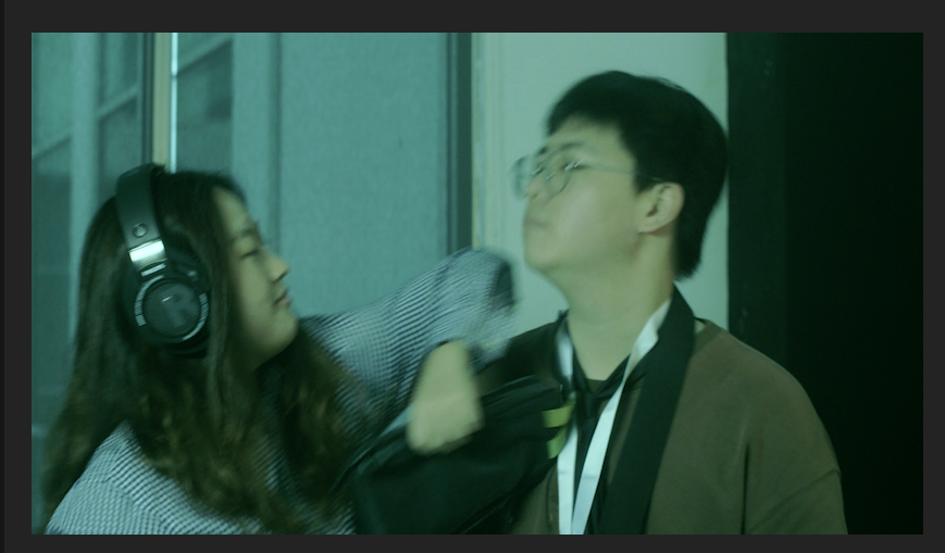
Greenish (cold),
Brownish (warm),
Desaturation, 50%-70%,
B & W, High Contrast.


Comments
Post a Comment